

What Colour Goes With Grey Walls?
Looking for the Perfect Grey Colour Combinations?
The bottom line: grey is in the middle of its most sophisticated revival in years. As a South African wall art curator, I have watched how the right partner colour can transform a grey room from flat to genuinely warm. The shift is away from the cool, builder-grade greys we all grew tired of, towards richer charcoals, warm mushrooms and soft minks.
Grey is not just making a comeback — it is getting a complete makeover. The question is no longer whether to use grey, but which colours bring it to life. This guide walks through the pairings that work, room by room, with art that carries each palette.
The secret to mastering grey lies in undertones. Cool greys lean blue; warm greys lean beige — and matching your accents to that undertone is what makes a scheme feel considered rather than cold. Sage is one of grey's most natural partners, so it's worth seeing what pairs with green before you settle the accents.
The Best Colour Combinations With Grey
Classic Grey & Navy Blue
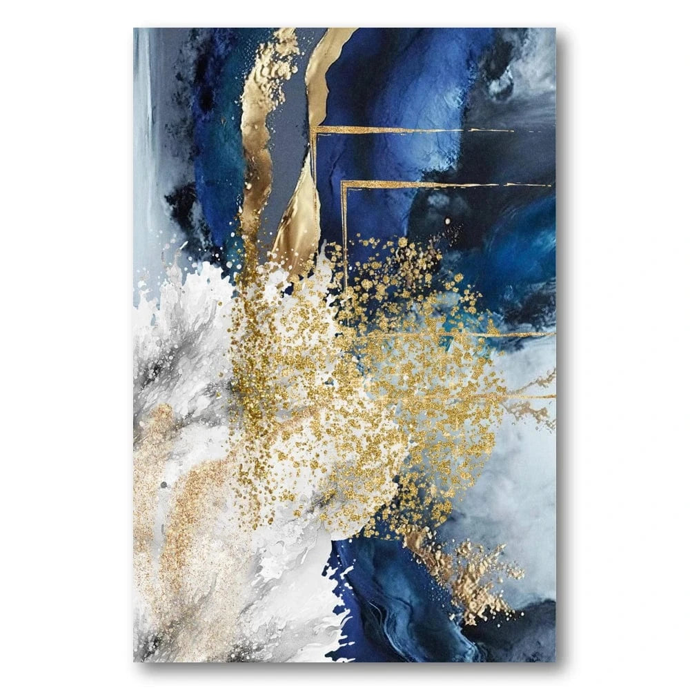
Navy Gold Abstract Art Print
This piece shows the grey-navy-gold combination at its best. Deep navy contrasted with gold accents brings exactly the sophistication this palette promises. Available in five sizes, from 41cm x 51cm to 102cm x 127cm.
Frame options: white timber creates crisp contrast, while natural timber complements the warm gold tones.
Trending Grey + Sage Green

Charcoal Grey + Crisp White

Grey + Soft Blue

Room-by-Room Grey Colour Guide
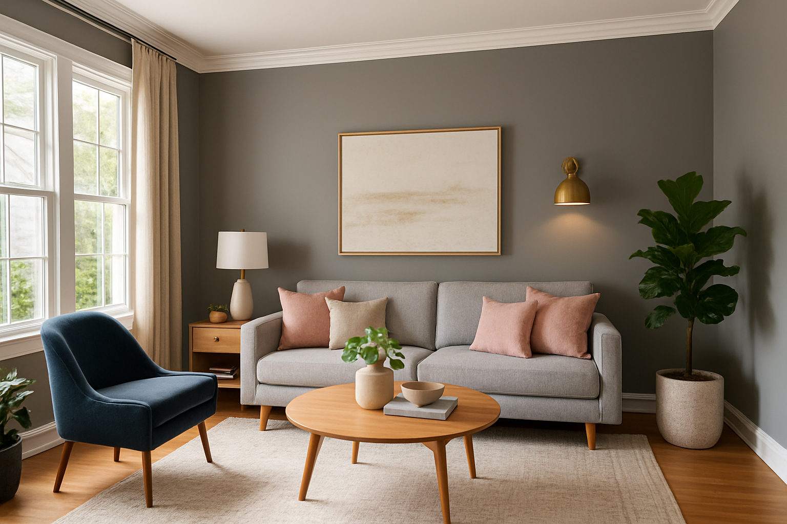
Living Room: Cool Grey + Navy + Brass

Create quiet drama with this timeless combination. Use light grey as your dominant colour (60%), navy for the major accents like cushions and throws (30%), and brass for hardware and fixtures (10%). It works especially well in rooms with good natural light.
Why this works:
- Natural light brings out cool greys
- Navy adds depth without overwhelming
- Brass warms the cool palette
- Contrast creates a clear visual hierarchy
Pro tips:
- Add warm lighting to balance the coolness
- Use different textures in the same colour family
- Bring in natural elements like wood
- Keep patterns simple and geometric
Bedroom: Soft Grey + Sage + Warm White
For a serene, restful bedroom, let soft grey walls be the backdrop, with sage green in the bedding and curtains and warm white in the trim and linen. The result feels calm and grounded without ever reading cold — the kind of room you exhale in.

Hallway: Grey + Greige + Natural Wood
Entrances and hallways are where grey earns its keep, because they often lack natural light. Pair a soft grey with greige (that grey-beige in-between) and plenty of warm timber so the space feels welcoming rather than tunnel-like. One large, atmospheric piece does more than several small ones here.

Open-Plan & Coastal: Grey + White + Soft Blue
In open-plan and light-filled spaces, a grey-and-white scheme with a whisper of soft blue keeps everything feeling airy and connected. White frames and pale walls let a misty, tonal piece breathe — perfect for homes near the coast or anyone chasing that calm, sea-glass palette.

Advanced Grey Styling & Professional Tips
Understanding Grey Colour Theory
Temperature balance
Cool greys (blue undertones) pair beautifully with cool colours like blues and greens. Warm greys (beige undertones) harmonise with warm colours like soft browns and dusty pinks.
Pro tip: match your grey's undertone to create a cohesive scheme.
Value contrast
Light greys need dark accents for visual interest, while dark greys need light accents so a space does not feel heavy.
Build depth through varying grey shades and contrasting values.
Neutral base theory
Grey is the perfect neutral base because it does not compete with other colours. Use it as around 60% of your palette and let your accent colours shine.
This is the foundation of a balanced, sophisticated scheme.
Monochrome Excellence Collection
These pieces show perfect value contrast and grey harmony. From our black and white wall art collection, they prove how a monochrome scheme can still create striking interest.
For a deeper guide to styling monochrome prints across different rooms, see our editorial.


Professional Grey Styling Tips
Add texture & layers
- Mix textures: velvet, linen, wool and silk in grey tones
- Layer shades: use two or three different greys for depth
- Include natural elements: wood, stone and plants prevent a sterile feeling
- Metallic accents: brass, gold and silver warm up cool greys
Lighting considerations
- Warm bulbs: 2700K-3000K stops grey feeling cold
- Layer lighting: ambient, task and accent lighting together
- Natural light: maximises grey's versatility
- Dimmers: adjust the mood through the day
Common Grey Mistakes to Avoid
Too many grey shades
Problem: creates flat, monotonous spaces lacking interest.
Solution: limit yourself to two or three greys and add a contrasting accent like navy, sage green or soft blue.
Wrong undertones
Problem: cool greys in south-facing rooms can feel cold and unwelcoming.
Solution: choose warm greys with beige undertones for darker spaces, cool greys for sunny rooms.
Poor lighting planning
Problem: grey can look dull in poor light.
Solution: use several light sources and warm bulb temperatures (2700K-3000K).
Perfect Frame Colours for Grey Rooms
White Timber
Fresh and modern. Creates crisp contrast and stops grey feeling heavy.
Black Timber
Timeless and classic. Adds dramatic elegance and makes grey look more luxurious.
Natural Timber
Light and contemporary. A light oak look complements grey's versatility perfectly.
Honey Stained
Warm and earthy. An African teak look adds warmth to cool grey schemes.
Year-Round Grey Versatility
One of grey's greatest strengths is how easily it adapts. Unlike trend-led colours, grey gives you a steady foundation that works year-round with simple accent changes.
Spring/Summer accents
- Sage green — fresh and botanical
- Soft blues — coastal and airy
- Crisp whites — clean and modern
- Natural textures — linen, jute, rattan
Autumn/Winter accents
- Deep navy — sophisticated drama
- Warm brass — cosy, golden glow
- Soft cognac — leather and wood tones
- Plush textures — velvet, wool, cashmere
Budget-Friendly Grey Makeover Ideas
Low budget (under R2,000)
- Grey throw pillows and blankets
- Small neutral abstract art prints
- Restyle existing accessories in grey tones
- Layer in linen and wool textures
Mid budget (R2,000-R8,000)
- A feature wall in a sophisticated grey
- A quality grey area rug
- Professionally framed grey artwork
- Grey curtains or window treatments
Investment pieces (R8,000+)
- Grey upholstered furniture
- A custom moody neutral abstract art collection
- Natural stone surfaces in grey tones
- An interior design consultation
The Feeling Grey Brings to a Room
Calm and considered
Grey reads as calm, balanced and grown-up. It is the colour of quiet confidence, which makes it ideal for bedrooms, studies and any space you want to feel restful.
Perfect for: offices, bedrooms, reading corners.
Keeping it warm
Grey can feel cool and distant, but it turns inviting the moment you add warm textures, soft lighting and one or two well-chosen accents. The goal is always to stop it feeling sterile.
Solution: add plants, wood tones and warm metals.
Grey Colour-Pairing FAQs
What colour goes with grey walls in a living room?
In a living room, the easiest partners for grey walls are navy, sage green and warm white, lifted with a single warm metal like brass. Navy adds depth without fighting the grey, sage keeps things calm and brass stops the scheme feeling cold.
Keep grey as roughly 60% of the room, the second colour around 30%, and the metal or accent at 10%. A soft abstract or muted landscape on the wall does a lot of the work here, tying the grey to your chosen accent.
What colour goes with a grey sofa?
A grey sofa is happiest against warm neutrals — cream, oatmeal, soft greige and natural wood — with cushions in one accent: dusty blue, sage or blush, depending on the mood you want. Cool greys lean towards blue and green accents, warm greys towards terracotta-free earthy tones and soft pink.
Hang artwork above it that carries both the grey of the sofa and a hint of your accent colour, so the sofa reads as part of a considered palette rather than a stand-alone block.
Does grey go with any colour?
Almost — but undertone is everything. Cool, blue-based greys sit beautifully with blues, greens and crisp whites; warm, beige-based greys are kinder to creams, soft browns and muted pinks. Matching the accent to the grey's undertone is what keeps a scheme looking intentional.
Every piece is made to order and hand-finished here in Cape Town, ready to hang straight from the box. If you would like help pairing a print to your exact shade of grey, we are only a message away — that is the part we love most.
Shop soft & neutral abstract prints
Free shipping across South Africa.


