






Key Takeaways
- Brain response: Neuroaesthetics research studies how abstract art engages brain regions linked to emotion, memory and reward
- Color Psychology: Blue is often linked with calm and warm colors like red and yellow with energy, though color research is still young
- Historical Foundation: Abstract movements like Color Field painting pioneered the use of pure color for emotional expression
- Therapeutic Applications: Art therapy professionals use abstract art to help process emotions and trauma
- Stone & Gray Collection: Curated abstract prints designed to enhance specific emotional atmospheres in your home
How abstract art affects our emotions represents one of the most fascinating intersections between neuroscience, psychology, and visual culture. As Susan Magsamen writes in Cerebrum, experiencing or creating art "sparks a dynamic interplay among brain cells that spearheads billions of changes affecting our thoughts, emotions, and actions." As specialists in curating transformative abstract art at Stone & Gray, we've witnessed firsthand how the right piece can fundamentally shift the emotional atmosphere of a space, drawing on decades of scientific research into the powerful connection between visual art and human psychology.
The Neuroscience Behind Abstract Art and Emotions
The field of neuroaesthetics, pioneered by neuroscientist Semir Zeki at University College London, has revolutionized our understanding of how art affects the brain. With the help of neuroimaging technology, researchers have discovered that there is an area of the brain called the medial orbital frontal cortex that always "lights up," or correlates with the perception of beauty, whether it is in response to visual, musical, mathematical, or even moral beauty.
What makes abstract art particularly powerful is its direct pathway to emotional centers. Abstract art frees our brain from the dominance of reality, enabling it to flow within its inner states, create new emotional and cognitive associations, and activate brain-states that are otherwise harder to access. This neurological freedom allows viewers to project their own emotional experiences onto the artwork, creating deeply personal and transformative encounters.
The Brain's Response to Abstract Art
Aesthetic experiences emerge from the interaction between sensory–motor, emotion–valuation, and meaning–knowledge neural systems. When we view abstract art, three key neural networks activate:
- Reward System: Linked to pleasure and liking
- Default Mode Network: Processes personal identity, meaning, and creativity
- Emotional Centers: Activates areas linked to mood regulation and stress reduction
Color Psychology: The Science of Emotional Response
Color psychology is still a young field, and a 2015 review in Frontiers in Psychology urges caution about applying its findings to real rooms. Research on color and alertness has shown that blue light increases subjective alertness and performance on attention-based tasks, while red can increase heart rate and signal dominance.
Blue: A Calmer Palette
Blue is often linked with calm, which makes it a natural choice for a bedroom or reading corner. That is about blue on the wall: blue light itself tends to make people more alert, as the research above shows.
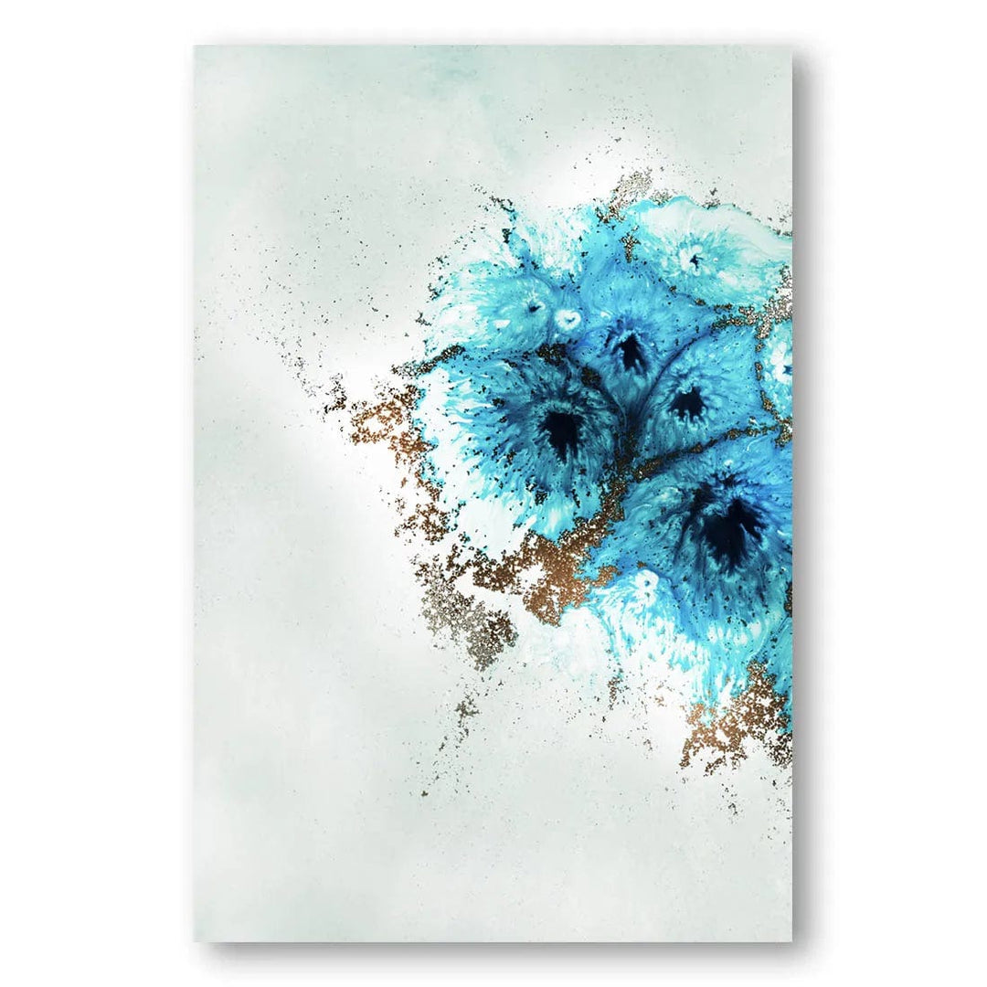
Aqua Aurora 1 Abstract Art Print By Petra Meikle de Vlas
Cool aqua tones for a bedroom or reading corner
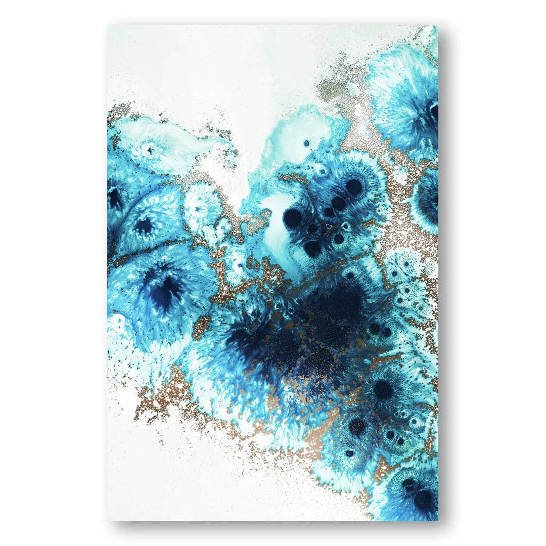
Aqua Aurora 2 Abstract Art Print By Petra Meikle de Vlas
The companion piece, with the same fluid blues
Warm Colors: Energy and Stimulation
Colors in the red area of the spectrum can evoke emotions ranging from feelings of comfort and warmth to feelings of excitement and urgency. Red can increase heart rate and signal dominance, while yellow boosts mood but may cause visual fatigue in large doses. These physiological responses make warm-toned abstract art particularly effective for spaces where you want to encourage activity, creativity, or social interaction.
Historical Context: Abstract Art's Emotional Revolution
Understanding how abstract art affects emotions requires appreciating the historical movements that established color and form as primary emotional communicators. The Abstract Expressionist movement of the 1940s and 1950s pioneered two distinct approaches to emotional expression through abstraction.
Color Field Painting: Pure Emotional Expression
Color Field painters like Mark Rothko, Barnett Newman, and Clyfford Still created art based on simplified, large-format, color-dominated fields. For Rothko, color evoked emotion, and each work was intended to evoke different meanings depending on the viewer. This movement established that color could be freed from objective context and become the subject in itself.
The influence of these pioneers can be seen in contemporary abstract art's continued focus on large areas of color designed to create immersive emotional experiences. Rothko said, "I paint big to be intimate," reflecting the notion toward the personal rather than the grandiose.
Composition and Form: The Architecture of Emotion
While color captures immediate attention, the compositional elements of abstract art create sustained emotional engagement. The visual brain segregates visual elements such as luminance, color, and motion, as well as higher-order objects, and aesthetic encounters engage these sensory systems.

Aspect Ratio Fusion Art Print
Balanced geometric blocks for a study or home office

Geometric Calm 3x4 Art Print
A quieter grid of shapes in the same family
Balanced, orderly layouts like these suit a study or home office, where you want the wall to feel settled rather than busy.
Art Therapy and Professional Applications
Art therapy looks at the same question from the making side. Dr. Cathy Malchiodi, PhD, LPCC, LPAT, REAT, is a leading international expert in art therapy and expressive arts therapy, with over 30 years of experience in trauma intervention.
"Expressive arts therapy--the purposeful application of art, music, dance/movement, dramatic enactment, creative writing, and imaginative play--is a non-verbal way of self-expression of feelings and perceptions. More importantly, they are action-oriented and tap implicit, embodied experiences that can defy expression through verbal therapy or logic."
Soft Neutrals: Creating Sanctuary Spaces
Neutral abstract art is the quiet option. It gives a room something to look at without competing for attention.

Abstract Glide Shapes Art Print
Soft shapes in muted tones for a calm bedroom

Whispers of Earth Art Print
Earthy neutrals that sit easily with timber and linen
These pieces exemplify how neutral abstract art can create what researchers call "soft fascination" – a gentle engagement that allows the mind to rest while maintaining interest. This psychological state is optimal for spaces intended for relaxation, meditation, or recovery.
Moody Abstracts: Embracing Emotional Complexity
Complex emotions require sophisticated visual languages. Recent research shows that people can intuitively understand the emotional content of abstract art, with certain visual cues being particularly effective in conveying specific emotions like contemplation and introspection.

Abstract Writing Method Art Print
Loose, written-looking marks for a moodier corner

Gestural Lines Art Print
Energetic black lines with room to read into them
These works demonstrate how abstract art can validate and process complex emotional states. The gestural quality of the marks creates what neuroscientists call "embodied simulation" – our brains mirror the energy and emotion of the artist's movements, creating a direct pathway to emotional understanding.
Practical Guidelines for Emotional Interior Design
Creating emotionally supportive environments with abstract art requires understanding both the science and your personal responses. Consider these practical guidelines:
Color Selection Guidelines
Color Mix Explorer
Move the sliders to mix blue, red and yellow, and see the palette you would be bringing into the room.
Your color mix
What this palette looks like
Mostly cool blue with a little warmth: a quiet, restful-looking palette with a few warm accents.
This describes the colors, not how they will make you feel. People respond to color differently, so trust your own reaction to a piece.
- For a calmer-looking room: Lean on blues and soft greens (try 60% or more blue in the explorer above)
- For a livelier room: Bring in warm colors in moderation (try 30-50% red and yellow)
- For a home office: A quieter, cooler palette (high blue, low red) keeps the art from competing with the work on your desk
- For something open to interpretation: Consider complex, gestural works that leave room for your own reading
Scale and Placement Considerations
Following the Color Field tradition, larger works create more immersive emotional experiences. As Rothko demonstrated, scale contributes directly to meaning – larger works create intimate rather than grandiose experiences. Place significant pieces at eye level in spaces where people spend extended time for maximum emotional benefit.
The Future of Abstract Art and Well-being
Emerging research in neuroaesthetics continues to validate what artists and collectors have long understood intuitively. The ultimate aim is to examine how aesthetic experiences can be used therapeutically to foster meaningful, desirable, behavioral change in a wide range of settings.
As our understanding deepens of how abstract art affects our emotions, we can make increasingly informed choices about the visual environments that support our mental health and well-being. What we see daily at Stone & Gray is simpler: the right piece changes how a room feels.
Conclusion: Choosing Art for How You Want to Feel
The relationship between abstract art and emotion is partly measurable and deeply personal. By understanding the neurological, psychological, and historical foundations of how abstract art affects our emotions, we can create living and working environments that actively support our emotional well-being.
Whether you're seeking the calming influence of color field-inspired blues, the grounding stability of geometric abstractions, or the complex emotional resonance of gestural works, our collection has a piece for the mood you want.
Ready to Choose Abstract Art for Your Mood?
Explore our curated collection of abstract prints, from calm blues to moody neutrals.
Shop Abstract Art CollectionResearch Sources & Expert Credentials
Dr. Cathy Malchiodi - PhD, LPCC, LPAT, REAT, leading international expert in art therapy and expressive arts therapy with over 30 years of clinical experience
Neuroaesthetics Research - Susan Magsamen, "Your Brain on Art: The Case for Neuroaesthetics", Cerebrum (Dana Foundation), 2019
Color Psychology Studies - Andrew J. Elliot, "Color and psychological functioning: a review of theoretical and empirical work", Frontiers in Psychology, 2015


