





Art for Hotel Rooms: Creating Memorable Guest Experiences
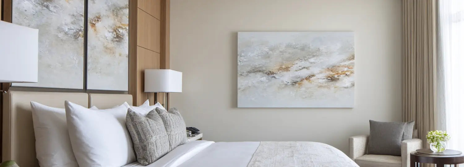
Why the Art Above the Bed Sets the Tone
In a guest room, the wall above the bed is the first thing a guest sees when they walk in and the last thing they look at before the lights go off. It does quiet work: a calm, well-chosen piece signals that someone has thought about the room, which is exactly the feeling that makes a stay memorable.
The brief for a guest room is narrower than for a public space. The art has to settle people rather than energise them, and it has to read warmly to a wide range of guests, because you can't predict who is sleeping there next. That points to soft, restful work in neutral tones.

A misty horizon in muted greys and warm sand, like Dawn's Serenity above, does this well. There is enough movement to hold the eye for a moment, but nothing sharp or loud to keep someone awake � the kind of piece guests register as "nice" without quite knowing why.
What Makes a Piece Right for a Guest Room
- Calming, not stimulating: soft edges and low contrast over bold graphics, so the room reads as restful.
- Broadly appealing: neutral, abstract or gentle landscape subjects that welcome guests of any age or taste.
- Durable and easy to live with: our prints are made to order and hand-finished in Cape Town, framed and ready to hang, so they arrive built for daily housekeeping rather than fussy upkeep.
If you are weighing soft abstracts against landscapes or representational work, our companion piece on when abstract art is the right choice for a space walks through the trade-off in more detail. For the public side of a property, the reception wall plays by different rules � we cover that in art for hotel lobbies.

Where a landscape might feel too literal, a quiet line piece such as Beige Serene Flow keeps the wall soft and modern. The single white line on warm sand gives the eye somewhere to rest without competing with the bed linen or the headboard.
Sizing and Hanging Art Above the Bed
Getting the scale right matters more than the artwork itself. A piece that is too small floats awkwardly over a wide headboard; too large and it crowds the bed. The aim is for the art to relate to the width of the bed below it.
What Size Art Should Go Above the Bed?
As a working rule, a single piece above the bed looks balanced when it spans roughly two-thirds of the bed's width � a touch narrower than the headboard, never wider than the mattress.
- Above a king bed: one large piece around 100cm wide, or a balanced landscape, holds the wall without overwhelming it.
- Above a queen or double: something in the region of 75cm to 90cm wide keeps the proportions comfortable.
- A portrait piece works well centred over a single headboard or a narrower bed, where a wide landscape would look stretched.

A wide, soft landscape like Southern Horizon Calm is made for the space above a queen or king. The horizontal format follows the line of the bed, and the warm, hazy palette keeps the wall feeling open rather than busy.
How High Should It Hang?
Leave a clear, consistent gap between the top of the headboard and the bottom of the frame � roughly a hand's width to 20cm � so the art reads as part of the bed rather than drifting up the wall. Centre it on the bed, not the wall, if the two don't line up. For a piece hung over a desk or console instead, the same logic applies: keep it centred on the furniture with breathing space above.

Not every guest room has space above the bed. Where there's a small writing desk or console, a calm portrait piece such as Foggy Lakeside Tranquility turns a working corner into something restful � useful in business-hotel rooms where the desk gets daily use.
Choosing Art Guests Will Quietly Appreciate
The safest, most broadly-liked choices for a guest room tend to be soft coastal scenes, hazy landscapes and gentle neutral abstracts. They suit almost any interior scheme and rarely divide opinion, which is what you want in a room that hosts a different person every few nights.

A muted coastal horizon like Coastal Serene Horizon is a good example � it carries a sense of place and calm without being tied to one taste or trend. Built on our soft, restful palette, it sits comfortably in a contemporary room or a more classic one.
A Few Common Questions
What kind of art is best for a hotel bedroom? Calming, low-contrast pieces in neutral tones � soft abstracts, hazy landscapes and coastal scenes � read as restful and welcome the widest range of guests. Bold, high-energy graphics are better kept to lobbies and corridors.
What size art goes above a bed? Aim for a piece that spans about two-thirds of the bed's width: roughly 100cm over a king, and 75cm to 90cm over a queen or double. Keep it narrower than the headboard and never wider than the mattress.
Do the prints arrive ready to use? Yes. Every piece is made to order and hand-finished in Cape Town, framed and ready to hang, with free shipping across South Africa.
Kitting out guest rooms? I'm glad to help you choose calming pieces and the right sizes for above the bed — everything is made to order in Cape Town, framed and ready to hang, with free shipping across South Africa.


