

What Colours Go With Blue?
Blue is the colour most of us reach for when we want a room to feel calm, and the one we hesitate over when it comes to pairing it with anything else. The good news, after years of curating prints for South African homes through Stone & Gray, is that blue is genuinely easy to live with. It behaves like a neutral. The question is never whether a colour goes with blue, but which mood you want the pairing to set.
Below are the four pairings I come back to most, each shown with a blue-toned print in a real room so you can see how the balance reads on a wall rather than on a colour wheel. The thread running through all of them is the range of blue hues themselves, from soft dusty blue to deep navy.
The four blue pairings worth knowing
Think of blue as your foundation and the second colour as the personality. Warm partners (gold, mustard, orange) bring energy and stop a blue room feeling cold; cool and natural partners (cream, sage, soft greens) lean into the calm. Here is how each plays out.
Navy & gold: quiet, grown-up contrast

Navy paired with warm gold is the most reliable way to make blue feel considered rather than cold. The gold reads as warmth, the navy holds it steady, and together they suit dining rooms and entryways where you want a little formality without anything shouting. Repeat the gold in a brass candlestick or a frame and the scheme ties itself together. Natural oak or a warm honey-stained frame both work well here.
Blue & warm gold: calm with a lift

A teal-leaning blue against warm mustard and ochre is the pairing I suggest most often for living rooms. Warm yellow tones balance cool blue so the space feels welcoming rather than clinical, and a small amount goes a long way. Keep blue as the larger presence and let mustard arrive in a couple of cushions or a throw. A crisp white timber frame keeps the whole thing feeling fresh.
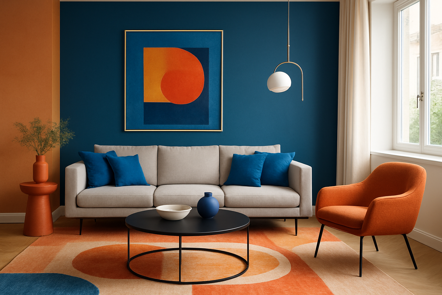
Blue & orange: the confident one

Blue and orange sit opposite each other on the colour wheel, which is exactly why they make each other look brighter. It is a bold pairing, so it belongs somewhere you want a bit of joy, like a kitchen-diner or a hallway. The trick is to let one colour lead and the other punctuate, then ground both with natural wood and a few warm neutrals so the contrast feels deliberate. A black timber frame gives it a clean, contemporary edge.
Navy & cream: restful and soft

For bedrooms, I lean towards deep navy softened with cream and a touch of gold. It is the most restful pairing of the four, and the cream stops the navy from feeling heavy. Dusty-blue walls, cream bedding and a single navy throw give you that layered, calm feeling without much effort. An oak frame keeps it warm; a white frame makes it crisper. This is also the easiest pairing if you are nervous about colour, because cream does most of the quiet work.
A simple way to balance it
Whichever pairing you choose, the same rough split keeps a blue room from feeling either flat or busy: let blue and your neutrals carry most of the space, and bring the second colour in as accents through art, cushions and small objects. If a cool blue starts to feel chilly, warm it with brass, wood or warmer light rather than adding more colour. Seeing a few blue tones side by side makes the choice far easier than picking from a single swatch.
Frequently asked questions
What colour goes best with blue?
There is no single answer, because it depends on the mood you want. Gold and mustard make blue feel warm and welcoming, orange makes it bold and energetic, and cream or soft sage keep it calm and restful. Navy and gold is the most universally flattering if you want one safe choice.
What goes with navy blue?
Navy is close to a neutral, so it pairs happily with warm metallics like gold and brass, with soft cream and white, and with natural wood tones. For a little more energy, add a single warm accent such as mustard or terracotta rather than a second strong colour.
Every print is made to order here in Cape Town, with free shipping anywhere in South Africa and ready to hang the day it arrives. If you would like a hand picturing a blue piece in your own room, I am always happy to help.


