

What Colours Go With Green? Your Complete Interior Design Guide
Looking for Green Colour Combination Ideas?
The bottom line: Green is nature's neutral and pairs with almost any color! As a South African wall art curator, I've seen how the right green color combinations can transform any room from ordinary to extraordinary. Research shows that 14% of people worldwide choose green as their favorite color, and 19.2% of students prefer green interior spaces for their calming effects.
Green is one of the most versatile colors in interior design. From sage green's modern sophistication to forest green's timeless elegance, green offers endless possibilities when paired correctly with complementary colors — and if you're working the other way round, our guide to how to style grey walls covers the neutral side of the same palette.
The key to mastering green color combinations lies in understanding which colors work best together. Deep olive green and sage green combinations are leading 2025's interior trends, with searches for "green color palette" increasing by 50% this year according to interior design statistics.
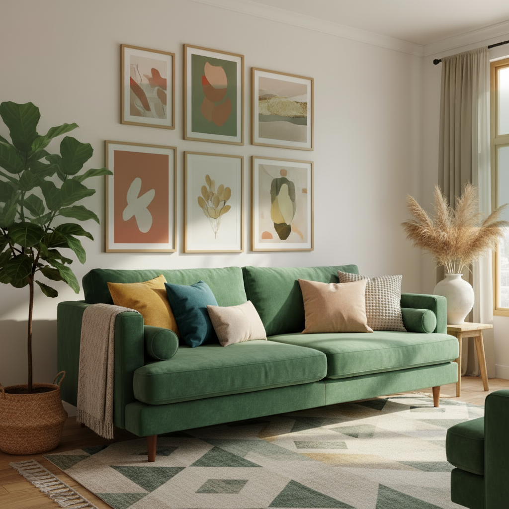
The Best Color Combinations With Green
Classic Green & Cream
Trending Green & Blush Pink
Earthy Green & Terracotta
Perfect examples of green and earth tone combinations from our soft neutral abstract art to balance green room designs


Botanical Art That Complements Green Color Schemes
Nothing enhances a green color palette quite like botanical wall art. These vintage palm and fern prints from our collection showcase how natural motifs can seamlessly integrate with green interior schemes, adding depth, texture, and authenticity to your space. For more inspiration on arranging and layering these prints, see our styling guide for botanical photography.


Why Botanical Prints Enhance Green Color Schemes
Our vintage palm and fern collection works perfectly with green interiors because these prints feature the same natural tones found in your color palette. The aged, vintage aesthetic adds sophistication while the organic shapes create visual harmony.
Pro tip: Use these botanical prints as your color palette inspiration. The natural greens, warm browns, and cream tones in these vintage illustrations provide the perfect foundation for your room's color scheme.
For South African homes, these tropical and indigenous plant motifs connect your interior with our beautiful natural landscape, creating spaces that feel both globally sophisticated and locally authentic.
The Science Behind Green Color Schemes
Recent research reveals fascinating insights about green in interior design:
- Green environments reduce stress and anxiety by up to 25% (ArchDaily Research) - https://www.archdaily.com/957104/color-beyond-aesthetics-the-psychology-of-green-in-interior-spaces
- 50% increase in bold color usage including green in 2025 homes (Interior Design Statistics) - https://www.jdsallabouthome.com/post/interior-design-statistics-and-facts
- Deep olive green is the #1 trending color for sophisticated interiors (RMCAD Color Trends) - https://www.rmcad.edu/blog/color-trends-in-interior-design-whats-hot-in-2025
Green Color Combinations by Room Type
Living Room
Best combinations: Sage green + cream + white
Why it works: Creates relaxing atmosphere perfect for conversation and entertaining
Frame recommendation: Natural timber frames complement green's organic nature
Bedroom
Best combinations: Forest green + blush pink + gold accents
Why it works: Green promotes restful sleep while pink adds warmth
Frame recommendation: White timber for fresh, modern look
Home Office
Best combinations: Deep olive + charcoal + white
Why it works: Green reduces eye strain and promotes focus
Frame recommendation: Black timber for professional sophistication

Advanced Green Color Strategies & Expert Tips
Understanding Color Temperature with Green
Green is unique because it sits between warm and cool on the color wheel. This makes it incredibly versatile for South African homes. Warm greens (with yellow undertones) pair beautifully with terracotta, cream, and gold. Cool greens (with blue undertones) work perfectly with white, grey, and silver accents.
Expert Tip from Stone & Gray
I always recommend starting with one shade of green as your base and building from there. Our Van Gogh prints featuring nature-inspired green palettes are perfect examples of how master artists used green with complementary colors.
For South African homes with lots of natural light, deeper greens work beautifully. In darker spaces, opt for lighter sage or mint greens to keep rooms feeling fresh and open.
Green and Metallic Accents
Gold & Brass
Perfect with forest and sage greens. Creates luxurious, warm combinations ideal for dining rooms and living spaces.
Silver & Chrome
Works beautifully with cool-toned greens like mint and seafoam. Perfect for modern, minimalist interiors.
Copper & Bronze
Adds warmth to olive and hunter greens. Great for bohemian and industrial-style spaces.
Stone & Gray's Frame Recommendations for Green Schemes
Our sustainably sourced genuine timber frames are designed to enhance green color schemes perfectly:
White Timber: Creates fresh contrast with any shade of green. The clean look makes green appear more refined and sophisticated.
Black Timber: Adds dramatic elegance and makes green appear more luxurious. Ideal for formal dining rooms and sophisticated living spaces.
Natural Oak Look: Complements green's warmth with organic wood tones. Perfect for creating cozy, inviting atmospheres in family rooms.
Honey Stained Timber (Kiaat look): Enhances green's richness with warm wood tones, creating grounded combinations perfect for traditional and transitional interiors.
Common Green Color Mistakes to Avoid
Using too many bright greens without grounding elements: This can feel overwhelming. Mix bright greens with neutral bases and natural textures.
Pairing green with cool grays exclusively: Creates sterile atmospheres. Use warm neutrals like cream, beige, or warm white instead.
Assuming green is too bold for small spaces: Lighter sage greens actually open up smaller rooms and create calm, spacious feelings.
Creating Your Perfect Green Color Palette
Understanding the psychological impact of different colors helps create meaningful spaces. Research from Design Dash shows that green promotes balance, reduces stress, and creates harmony - essential qualities for modern South African living. When you're designing around green, consider these elements:
Green Colour Pairing FAQs
What colours go with sage green in a bedroom?
Sage green is one of the easiest greens to live with in a bedroom because it reads almost as a warm neutral. Pair it with cream, soft white and natural oak for a calm, restful scheme, then add warmth with a single olive or taupe accent in the bedding. Avoid pairing sage with cool grey alone, which can feel flat — a botanical print with deeper green leaves gives the eye somewhere to rest and keeps the palette grounded.
What colours go with emerald or forest green?
Deeper greens like emerald and forest green carry more drama, so they pair beautifully with blush pink, warm gold or brass, and crisp white. For a richer feel, bring in a touch of navy or charcoal. These darker greens suit dining rooms and feature walls, where art with bold botanical or abstract detail can hold its own against the depth of colour.
Building a room around green? Let the art set the tone.
Our botanical and landscape prints are made to order here in Cape Town, so you can pick the exact green that suits your sage walls or olive sofa. Every print arrives framed and ready to hang, with free shipping anywhere in South Africa.
Shop botanical wall art


