





Art For Hotel Lobbies: Creating Memorable First Impressions
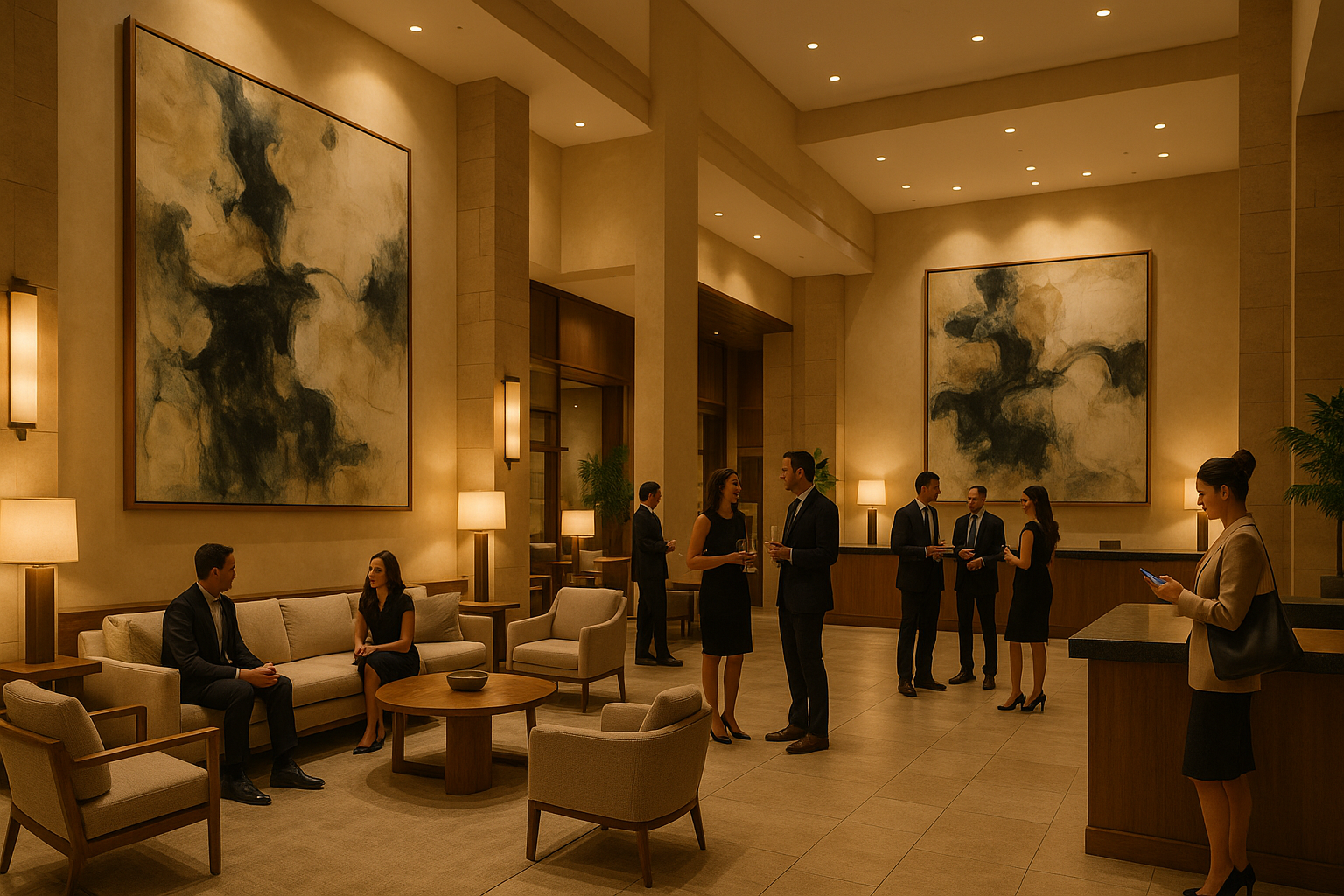
The lobby is the one room every guest walks through, and it sets the tone before a single word is exchanged at the desk. Reception is where a first impression is either made or missed, so the art you choose here does more work than anywhere else in the building. Over years of supplying prints to South African hotels and guest houses, I've found the pieces that hold up best in a lobby are the calm, broadly appealing ones — large, composed and easy to live with rather than loud.
Why lobby art carries more weight than the rest of the building
A guest forms an impression of your property in the first few seconds of stepping inside. Research published in ScienceDirect, which examined 455 participants across millennial and non-millennial groups, found that lobby interior design — particularly contemporary and biophilic, nature-inspired elements — has a significant effect on guest emotion, satisfaction and booking intention. In other words, the reception space is doing quiet commercial work, and the art on its walls is part of that.
This is why I steer hotels toward pieces that read as considered rather than decorative. A single large work above the reception desk, or a calm landscape behind a lounge sofa, does more for a first impression than a scatter of small prints. The goal is a space that feels settled the moment someone walks in.
A warm abstract for the main reception wall
The wall directly behind or beside the front desk is your strongest position, so it earns a piece with presence. A warm, earthy abstract carries a large reception wall without shouting — the texture and movement give it depth from across the room, while the neutral palette keeps it welcoming to every guest who walks in.

Colours that make a reception feel calm
Eye-tracking research published in PMC (National Center for Biotechnology Information) studied visual comfort in hotel lobbies, measuring how illuminance, wall colour and decoration style affect guests. The finding most useful for art selection: warm colours bring significantly more comfort than cool ones, and balanced, normal lighting is more comfortable than either harsh brightness or dim gloom. Soft neutrals, warm greiges and natural earth tones are the safe, broadly appealing ground for a reception space.
A serene landscape for the lounge seating
Where guests pause — the lounge sofa, the waiting cluster — is where a calm landscape earns its place. A soft, atmospheric horizon settles the eye while people wait to check in, and its quiet palette sits comfortably against linen and bouclé without competing for attention.

Warm, broadly appealing palettes for a lobby
- Warm neutrals — the safest ground for a space every guest passes through
- Soft beiges & creams — calm the eye and take the edge off travel fatigue
- Natural earth tones — ground the room and feel settled rather than stark
- Soft horizons & abstracts — restful subjects that read well from across a room
A wide landscape for a console or long wall
Long reception walls and console runs suit a piece that follows the horizontal line rather than fights it. A wide, landscape-format work above a console reads as deliberate, filling the space without crowding the surface below or the lighting above.

Sizing art for a lobby so it reads from across the room
The most common mistake in a reception space is art that's too small for the wall. Lobbies are large, double-height rooms seen from a distance, so a piece that would suit a hallway gets lost above a reception desk. Scale up: one generous work almost always beats several small ones competing for the same wall.
A sizing starting point for lobby walls
- Main reception wall: one large statement piece, sized to read clearly from the entrance
- Lounge & seating clusters: a calm medium-to-large work centred over the sofa
- Behind the front desk: a composed piece that suits the brand without distracting
- Concierge & transition walls: a single considered print rather than a busy gallery wall
A refined piece for the concierge corner
Smaller stations — the concierge desk, a side console — reward a more refined, quieter piece. Fine gestural lines on a pale ground read as polished up close, where guests stand to ask a question, without overwhelming a compact wall.

Choosing art that works across every guest
A lobby has to please a far wider audience than a guest room. Families, business travellers and couples all pass through the same reception, so the art needs to feel welcoming to all of them. This is the case for composed neutral abstracts and soft landscapes: they read as tasteful across demographics without leaning into any one style hard enough to alienate someone. Where a large statement piece can anchor the room, a quieter palette keeps the welcome universal.
Calm neutrals for a waiting area
For the waiting nook — a pair of tub chairs, a side table — a soft neutral abstract is the easy, broadly appealing choice. It holds the wall without demanding attention, exactly what you want where guests sit for a few quiet minutes.

Practical notes for a high-traffic reception
Lobby art has to look good under varied lighting and stand up to a busy room. Our prints are made to order in Cape Town on archival fine-art paper and finished with professional framing in sustainably sourced Obeche timber, in four frame finishes — White, Black, Natural and Honey Stained — so a piece can be matched to the existing reception scheme. Each one arrives ready to hang.
- UV exposure: a real consideration in sun-filled South African lobbies — position pieces away from harsh direct light
- Secure mounting: use proper wall anchors for larger works in a high-traffic space
- Easy upkeep: sealed frames keep dust and moisture at bay in a busy room
- Coordinated lighting: sit the art within your existing lobby lighting so it reads as intended
Carrying the look beyond reception
Once the lobby is settled, the same calm direction can run through the rest of the property. If you're looking at the in-room side next, our guide to art for hotel rooms covers choosing pieces for guest bedrooms, where the brief shifts from first impression to restful stay. Coordinating the two creates a cohesive feel from the front door to the room key.
Hotel lobby art — common questions
What kind of art suits a hotel lobby reception?
Calm, broadly appealing pieces work best: composed neutral abstracts and soft, atmospheric landscapes in warm tones. They read well from across a large room, feel welcoming to every guest who walks in, and avoid leaning into a single style hard enough to date or alienate. Save bolder, more personal choices for smaller, more private spaces.
How big should art be above a reception desk?
Bigger than most people expect. Lobbies are large rooms seen from a distance, so a single generous piece almost always reads better than several small ones. Size the work to be clearly legible from the entrance, centred over the desk or console, with breathing space above it — rather than choosing a print scaled for a hallway.
Fitting out a reception space? I'm happy to help you choose pieces and sizes that suit your lobby — everything is made to order in Cape Town, framed and ready to hang, with free shipping across South Africa.
References & Further Reading
- Hotel Lobby Design Impact Study: ScienceDirect
- Visual Comfort in Hotel Lobbies: PMC, NCBI


