


Abstract Art for the Living Room: A Styling Guide
| Key Takeaways |
|---|
| - Abstract work is led by colour, mood and scale rather than a literal subject - Match the palette to the room so the piece sits with it, not against it - One large abstract anchors a wall; smaller pieces group into a gallery wall - Bold colour lifts a room; tonal work keeps it calm - Stone & Gray abstracts are made to order in Cape Town, free shipping nationwide |
Abstract art is the most forgiving thing to hang in a living room, because there's no fixed subject to clash with the rest of the space — it works on colour, mood and scale instead. This guide stays with abstract work specifically: how to read those three qualities and choose a piece that settles into the room. If you're after broader ideas across all styles, our living room wall art ideas guide covers the wider picture.
Bold Colour: When You Want the Room to Lift
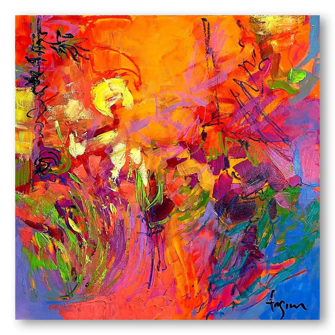

Strong colour gives a living room a focal point, which is useful when the rest of the room runs neutral and needs one clear note. The Emblaze print carries warm, saturated tones, while the Walking Wild Rose Beach print leans into cooler coastal colour — either works best against a plain wall, so the colour has space to read.
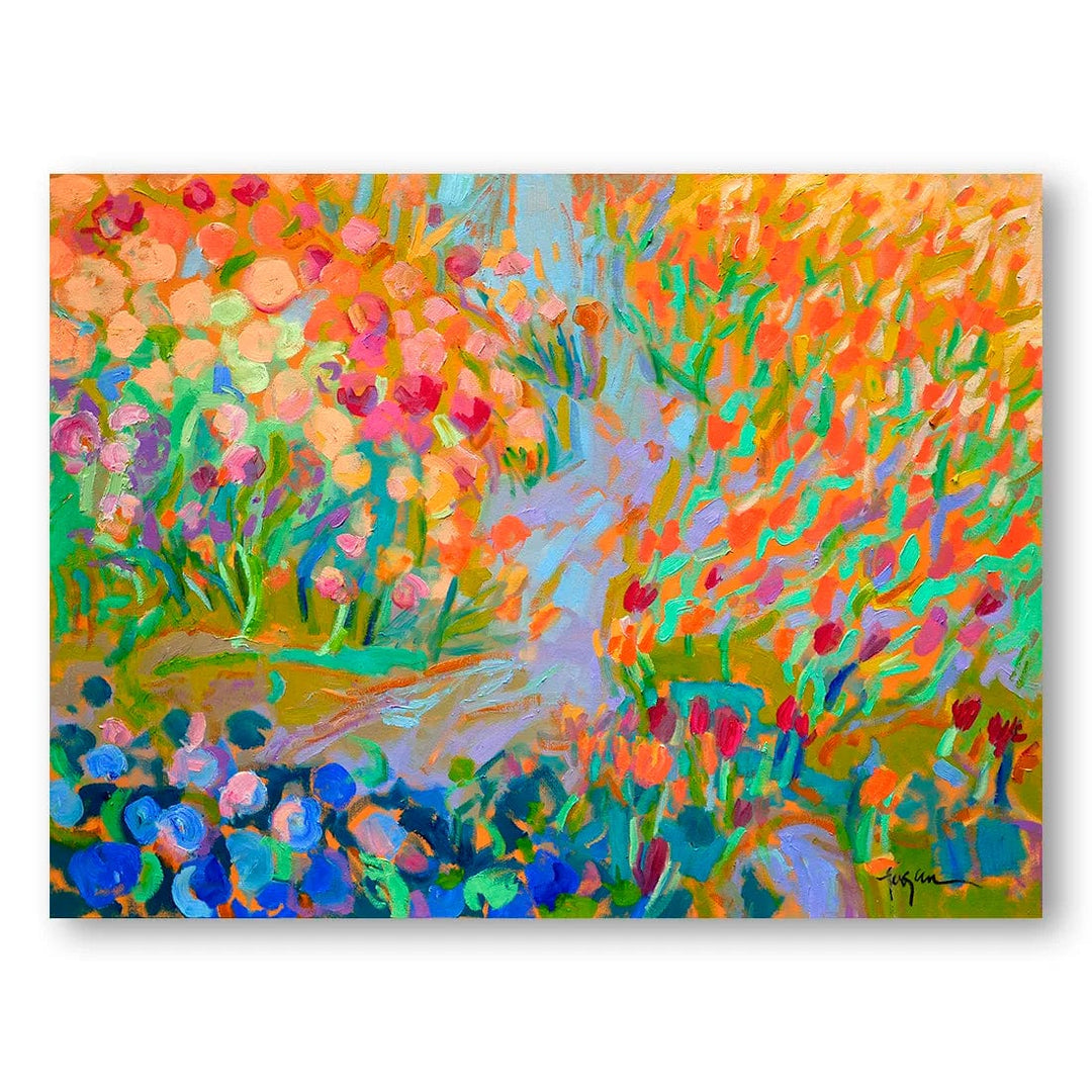
Nature-Led Abstracts: Colour That Reads as Soft
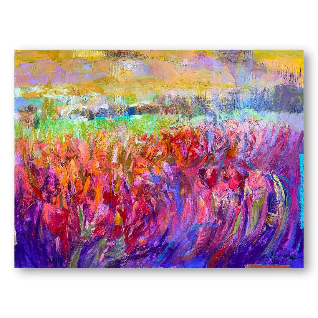
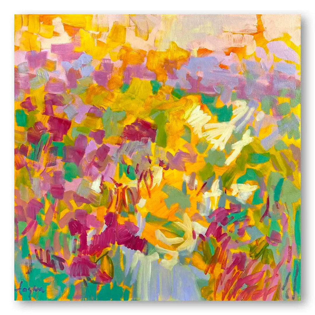
Abstracts that draw on natural forms use colour more loosely, so they carry interest without the hard edges of a bold geometric piece. The Pink & Purple Iris Fields print works in muted florals, and the Sundance print holds warm, hazy tones — both sit easily in a room you want to feel relaxed rather than busy.
Energetic Abstracts: Movement and Pattern
Pieces with a lot of movement and scattered colour bring energy to a room, so they suit a space that already feels lively rather than one you want kept calm. The Holiday Abstract uses bright, broken colour, while the Enchanting Forest print works in a landscape format that fills a wide wall well.
Detailed Abstracts: Pieces That Hold a Closer Look


Some abstracts carry more detail, so they reward a second look and suit a wall you sit close to rather than pass quickly. The Parrots Amid Blooms print layers tropical colour and form, while Floating Dots Harmony works in pattern and repetition — both hold attention up close, which is where a sofa-height wall puts them.
Working with Colour, Mood and Scale
- Lead with colour: Pull one colour from the piece that already appears in the room — a cushion, a rug — so the abstract reads as part of the scheme.
- Match the mood: Tonal, muted work keeps a room calm; saturated colour lifts it. Decide which the room needs before the piece itself.
- Get the scale right: One large abstract anchors a bare wall, while smaller pieces group into a gallery wall — measure before choosing.
- Give it room: Leave clear wall around the piece so the colour and form aren't crowded.
- Choose what holds up daily: The piece you keep looking at is the one that belongs in a room you live in.
"Abstract art is not the creation of another reality but the true vision of reality." - Piet Mondrian
Why Abstract Work Suits a Living Room
- It adds colour without committing the room to a literal subject, so it's easy to live with.
- It reads differently as the daylight shifts, which keeps a much-used room from feeling static.
- It scales both ways — one large statement piece or a grouped gallery wall.
- It gives a neutral room a single point of focus.
- It pairs with most furniture, because there's no fixed subject to match.
A Note on Lighting
Lighting changes how an abstract reads — warm light deepens earthy tones, while cooler light sharpens blues and greys. A picture light or a nearby lamp lets you control that, so the piece looks settled in the evening as well as by day.
Displaying Your Abstract Piece
- Build a gallery wall: Mix sizes within one palette so the grouping holds together.
- Make it the anchor: A single large abstract sets the focal point of the room.
- Match the frame to the work: A frame colour should sit with the art, not pull against it.
- Use the quieter walls: A piece above a console table or in a reading corner earns its place too.
How to Choose the Right Abstract
- Start with the palette: Look for an abstract that picks up or complements the colours already in the room.
- Measure the wall: Choose a size that fills roughly two-thirds of the wall or furniture below it.
- Settle the mood: Softer colour for calm, stronger colour for energy.
- Match the form to the room: Clean, geometric abstracts suit a modern space; looser, layered work suits an eclectic one.
- Trust the piece you keep returning to: That instinct is usually right.
Choosing Your Piece
Decorating with abstract art comes down to reading the room first — its colours, the mood you want, the wall you're filling — and choosing the piece that fits. Whether that's the warm energy of the Emblaze print or the softer tones of the Iris Fields, the right choice is the one that sits comfortably in the space you live in.
Every abstract is made to order in Cape Town and ships free across South Africa. You can see the full range in our bright and bold abstract collection.


