

What Colours Go With Red Walls?
Looking for Red Colour Combination palettes?
The bottom line: Red is having a quietly sophisticated moment. As a South African wall art curator, I see it most often where people least expect it — a single deep-red abstract above a console, a terracotta landscape over a bench — doing far more work than a whole wall painted in the colour.
Red is one of the most powerful colours in interior design, but knowing which colours go with red is what keeps a scheme feeling considered rather than loud. From deep burgundy's regal calm to coral's contemporary warmth, red offers a surprising range once you pair it well.
The trick is restraint. Terracotta and the “unexpected red” approach — a small dose of red where you don't expect it — are leading the way this year, and they're far easier to live with than an all-over red room.
The Best Colour Combinations With Red
Classic Red & Navy Blue

Red & Black
Red and black is the boldest pairing here, and the easiest to overdo. The way to keep it sophisticated is to let one piece of art carry the contrast rather than the whole room. The print below pairs raw crimson and magenta with a black brushstroke on a soft blush ground — all the drama of red-and-black, framed and contained.

Red & Cream
If red-and-black feels too strong, soften it. Crimson against warm cream is the gentlest way to bring red into a room — the negative space does the calming. It reads fresh in a dining nook or hallway, especially with a light-oak console and a single red ceramic to echo the artwork.

Warm Terracotta & Earth Tones

Terracotta is red at its most liveable — the brick, rust and clay end of the family. It sits beautifully with beige plaster, warm grey and natural oak, which is why it anchors so many bohemian and Mediterranean-style rooms. A landscape abstract in these tones reads warm rather than fiery.

Red & Green

Red and green are opposites on the colour wheel, which is exactly why they balance each other when handled with restraint. Skip the bright festive version — reach for deep red and muted, sage or eucalyptus green instead. A print that already holds both tones lets you carry the pairing into cushions and a sprig of greenery without trying too hard.

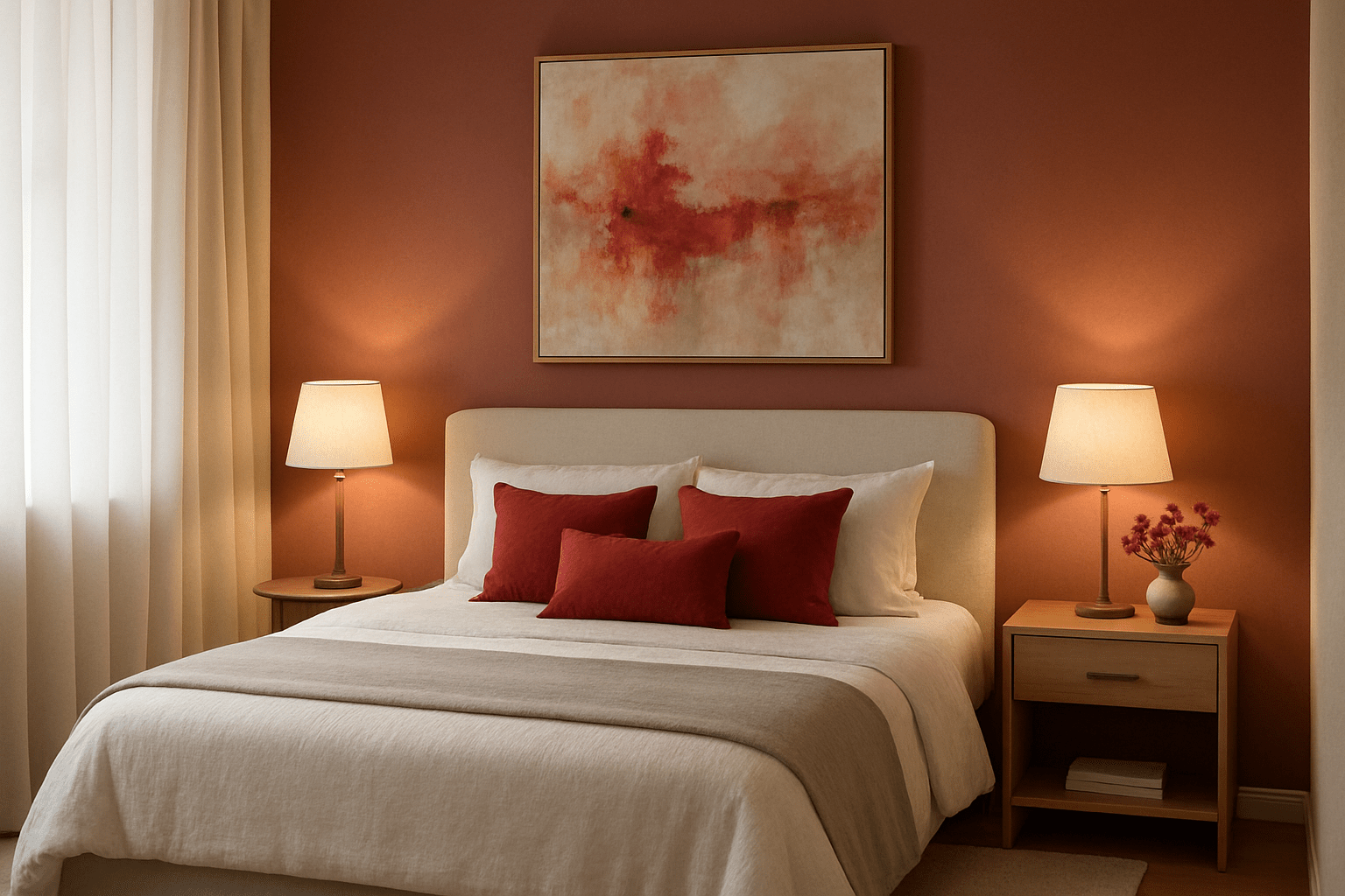
Coral & Blush
Coral is the softest, most contemporary way into red — warm, a little pink, and easy to live with in a bedroom or sitting room. Paired with blush and warm neutrals it feels calm rather than bright. This is the combination to reach for if a true red feels like too much commitment.

Pro Tips for Red Colour Palettes
- Start small: bring red in through art, a cushion or a vase before committing to larger pieces.
- Use the 60-30-10 rule: keep red to roughly 10% of a room as an accent for a considered, liveable look.
- Layer different red tones: burgundy, terracotta and coral together give depth without feeling flat.
- Balance with metals: brass, gold and copper warm red beautifully; a slim white or oak frame keeps it crisp.
Frequently Asked Questions
What colour curtains go with red walls?
Keep curtains quiet so the walls do the talking. Soft cream, oatmeal and warm white are the safest choices — they frame red without competing with it. For a richer, more enveloping room, a deep navy or charcoal curtain works well. Avoid a second strong colour at the window; it tends to fight the walls.
What colour goes best with red in a living room?
For most living rooms, warm neutrals — cream, beige and natural oak — are the easiest partners, with navy or deep green as an accent if you want more contrast. Let one element carry the red (a piece of art, a rug or a sofa) and keep the rest restrained so the scheme feels intentional.
Perfect Frame Colours for Red Art
White timber: creates crisp contrast and keeps red from feeling heavy — the cleanest, most refined look.
Black timber: adds drama and makes red feel more luxurious. Ideal for formal dining and sitting rooms.
Natural oak: echoes red's warmth with organic wood tones — perfect for cosy, earthy rooms.
Gold or brass: enhances red's richness with metallic warmth, lovely in traditional and transitional interiors.
Building a room around red? Let the art set the tone.
Our red, burgundy and coral prints are made to order here in Cape Town, so you can choose the exact tone that suits your walls, your sofa or your scheme. Every print arrives framed and ready to hang, with free shipping anywhere in South Africa.
Shop red wall artExplore More Colour Inspiration
- How Abstract Art Affects Our Emotions — the psychology of colour in art, and how it shapes the mood of a room.
- Redouté Botanical Illustrations — classic botanical prints featuring deep red roses and blooms from the master illustrator.
- Top 10 Interior Design Trends — where warm, saturated colour fits into the wider design picture.


