

What size is best for a gallery wall?
A gallery wall should occupy roughly 60 to 75 percent of the available wall space — large enough to read as the room's intended focal point, restrained enough to leave breathing room around the edges. The arrangement's outer footprint is what matters most, not any single piece within it. Sketch the envelope first; choose the prints second.
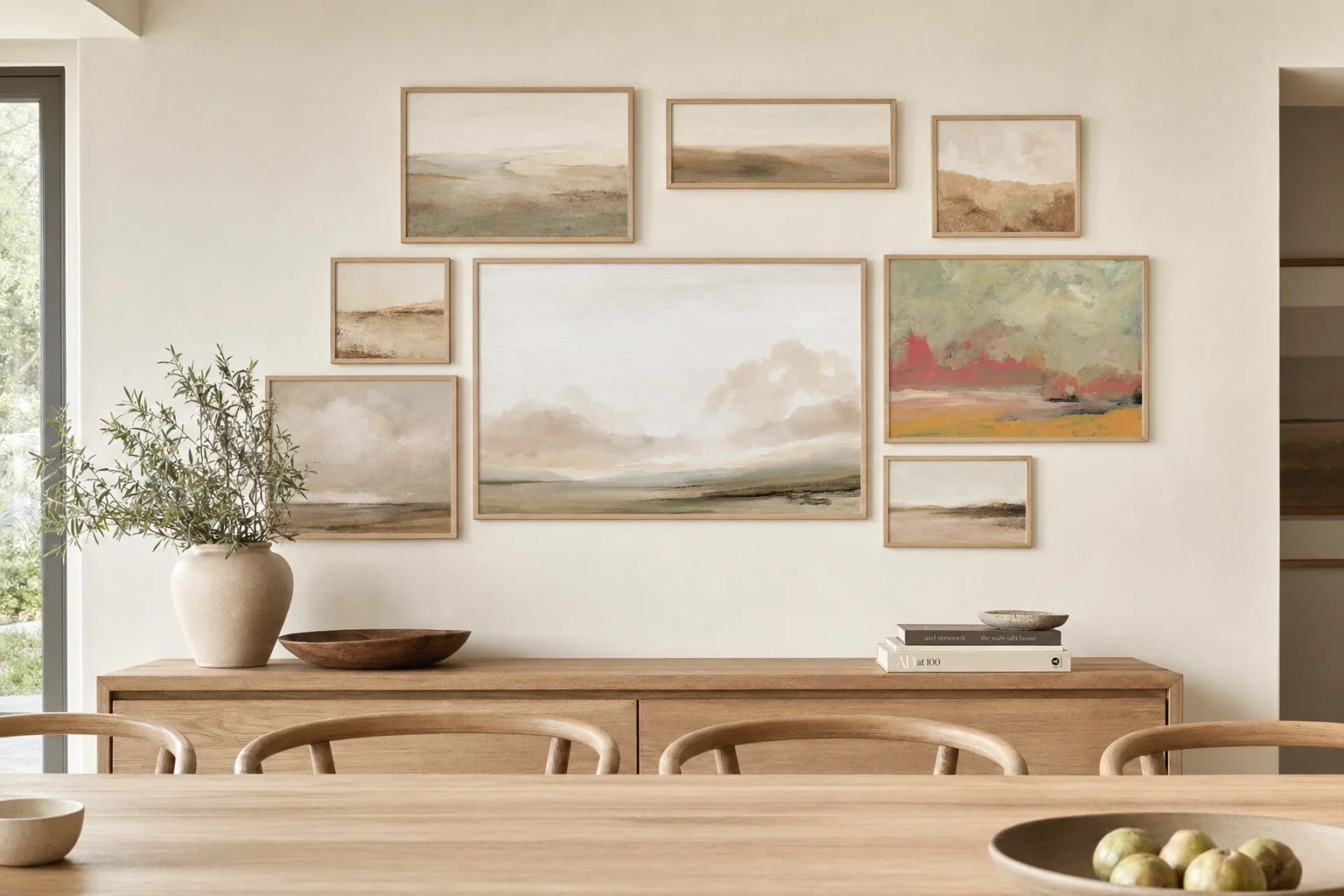
A salon-style gallery wall in white oak frames — six prints occupying roughly 70 % of a 2.4 m wall in a Cape Town dining room.
The 60 to 75 percent wall envelope
The single number that turns a gallery wall from a busy collage into a composed arrangement is the percentage of wall it occupies. Below 60 percent, the wall reads as under-dressed — a few small frames adrift in negative space. Above 75 percent, the wall starts to feel oppressive, with too little air around the arrangement for the eye to rest.
The envelope is measured edge-to-edge, including the gaps between frames. A 2.4 metre wide wall wants a gallery footprint of roughly 1.45 to 1.80 metres across; a 1.8 metre wide wall wants 1.10 to 1.35 metres. Sketch this envelope on paper before any prints are chosen — it is the only measurement the room will quietly enforce.
The same maths applies to the vertical dimension when the wall is unusually tall. For a 2.7 metre ceiling with a couch beneath, the gallery's vertical footprint is the available wall height between couch-back and ceiling cornice, multiplied by 60-75 percent.
Anchor pieces, and the prints that orbit them
Every gallery wall we mock for clients begins with a single anchor — the largest print in the arrangement, which decides the visual weight of everything else. The anchor is usually 50 to 60 percent the size of the smallest dimension of the gallery's footprint. A 1.6 m wide gallery wants an anchor in the region of A1 (594 × 841 mm); a 1.2 m wide gallery wants an A2 anchor.
The supporting prints orbit the anchor in pairs or odd groupings. A2 and A3 are the workhorse sizes for satellite pieces. A4 reads as too small in most arrangements unless used in a deliberate cluster of three or more.
The arithmetic to remember: one anchor + four to eight satellites is the range that consistently looks composed. Three pieces feel sparse; ten or more start to read as visual noise unless the wall is genuinely vast.
A gallery wall is not a collection of prints. It is one arrangement that happens to be made of many.
— A Note from the Studio
Spacing, the unsung hero
The gap between frames does more for a gallery wall's coherence than any single print within it. Aim for 5 to 8 centimetres of consistent spacing — tight enough that the arrangement reads as one composition, generous enough that the prints don't feel crammed.
Tighter than 5 cm and the eye reads the gallery as a single dense object, which can work in a corridor or a small powder room but rarely in a living space. Wider than 10 cm and the arrangement starts to dissolve back into a series of unrelated prints sharing a wall by accident.
The gap should be _identical_ on every side — vertical and horizontal — for as much of the arrangement as possible. The rare exception is a single deliberate ‘river' of negative space that runs through the gallery as a design feature, but that is a level of intent most rooms don't need to attempt.
Sizing by gallery shape
Different gallery layouts ask for different print-size mixes. Here is what we see working most consistently in South African homes.
| Gallery Layout | Anchor Print | Satellite Mix |
|---|---|---|
| Tight Grid (3×3 or 4×3) Symmetrical, formal | All matching A3 or matching A2 | No anchor — uniform sizing throughout |
| Salon Hang (mixed organic) 1.6 – 2.0 m wide | A1 (594 × 841 mm) | 4-6 satellites in A2 + A3 mix |
| Horizontal Run Above couch or hallway | A1 landscape or pair of A2 | 2-4 A3 prints flanking the anchor |
| Vertical Stack Stairwell or narrow wall | A2 portrait at eye line | 2-3 A3 prints stacked above and below |
Gallery footprints are measured edge-to-edge including spacing — aim for the arrangement to occupy 60-75% of the wall's width, no more.
When to resist the gallery wall altogether
Honestly, not every wall wants one. A wall with strong architectural features — mouldings, exposed brick, a textured plaster finish — is usually better served by a single confident piece that respects the surface beneath it.
A gallery wall on a textured wall reads as competition; a gallery wall above a heavily patterned couch reads as visual gridlock; a gallery wall in a small room with low ceilings often reads as wallpaper. The rooms we see this work in best are quiet, well-proportioned spaces with calm walls and ceilings of 2.6 metres or more.
If the room fights the idea every time it is sketched out, the room is right. A single oversized print, sized to two-thirds rule of the furniture below, is often the answer the room was asking for all along.

Planning a gallery wall?
Photograph the wall, measure its width and height, and send both through. We'll send back a scaled sketch with anchor + satellite suggestions, all sized to the 60-75 percent envelope — usually within the same day.
Message Nikki on WhatsApp →


