

What Colours Go With Yellow?
Yellow is one of the most uplifting colours you can bring into a room — but it rarely works alone. The magic is in the pairing. Get the partner colour right and yellow feels warm, considered and grown-up; get it wrong and it tips into busy or brash. As a South African yellow wall art specialist at Stone & Gray, here are the combinations I come back to again and again — each one shown with a print that carries the palette for you.
A quick principle before the pairings: let one colour lead. The classic 60-30-10 rule — a dominant colour at 60%, a secondary at 30%, and an accent at 10% — keeps yellow from taking over. In most rooms yellow is happiest as the accent, with a calmer colour doing the heavy lifting on the walls and large furniture.
Yellow & Grey: The Easy Modern Pairing
If you only try one yellow combination, make it this one. Grey is a quiet, cool neutral that lets yellow read as warm and deliberate rather than loud. Soft dove greys, deeper charcoals and blue-greys all work — the cooler the grey, the more the yellow glows against it. It's the safest way to introduce yellow into a living room or bedroom without committing to bold walls.

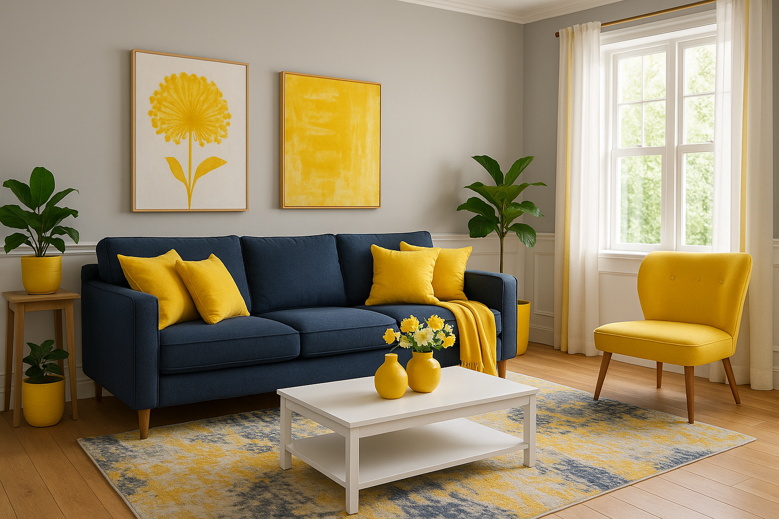
Here gold brushwork sits against navy and grey, so the print does the pairing for you — pull the mustard tones out into a cushion or a chair and the whole scheme settles. Navy is yellow's near-complement on the colour wheel, which is why this grey-blue room feels balanced rather than flat.
Yellow & Green: Fresh and Grounded
Yellow and green are neighbours on the colour wheel, so they sit together naturally — think early spring, or sunlight through leaves. Sage and olive greens calm yellow down and keep it from feeling childish, while a brighter yellow lifts an otherwise earthy green scheme. It's a lovely combination for a dining space or a bright corner that you want to feel alive.

This Bauhaus print pairs a bright sun-yellow with deep teal-green on a soft cream ground — a tidy, graphic way to bring both colours into a room at once. Echo it with a green plant and a yellow ceramic and the look is done.
Mustard & Earthy Tones: Warm and Welcoming
Mustard is yellow grown deeper and more sophisticated — it has brown in it, which is why it pairs so easily with tan, terracotta, rust and ochre walls. This is the cosiest end of the yellow family: a reading corner, a snug, a room you want to feel enveloping. Natural materials like leather, timber and wool are its natural companions.

The ochre and gold gestures in this piece tie straight into an earthy wall colour, a tan leather chair and a mustard throw. For more in this register, browse our bright and bold abstract collection.
Yellow & White: Crisp and Sunlit
For a brighter, more contemporary feel, set yellow against plenty of white. White gives yellow room to breathe, so even a bold sunshine or orange-yellow stays cheerful rather than overwhelming. This is the pairing for kitchens, home offices and entryways — anywhere you want a clean, energising lift in the morning.

Against a soft white wall and light timber, this yellow-and-orange sun feels graphic and fresh — a few yellow desk accessories are all it needs to echo the print.
Yellow & Neutral: Soft and Liveable
Not every yellow has to shout. Warm golden and honeyed tones sit beautifully with beige, oatmeal and pale oak for a scheme that's restful rather than bright. This is yellow at its most easy-going — perfect for a bedroom, where you want warmth without energy.

Backlit golden leaves bring a gentle, sunlit warmth that suits a calm neutral bedroom — soft enough to live with every day, warm enough to feel like sunshine.
Choosing the Right Yellow Art for Your Room
I always suggest starting with artwork when you bring yellow into a space — it's the lowest-risk way to test a colour before you commit to paint or big furniture. A print lets you live with the tone, see how it shifts through the day, and decide how much yellow you actually want.
A few simple rules of thumb:
- Smaller rooms: lean on softer, muted yellows and keep to one or two yellow pieces, balanced with plenty of white or neutral.
- Larger rooms: bolder, more saturated yellows hold their own — you can layer a few shades or build a small gallery wall.
- Watch the light: yellow shifts a lot through the day, so where you can, picture the wall in both morning and evening light before deciding.
Our prints come in five sizes on premium art paper or canvas, and four handcrafted genuine-timber frame finishes — White, Black, Natural (a light oak look) and Honey Stained (a warm Kiaat look). Natural oak suits ochre and mustard tones; the honey finish flatters golden, warmer yellows.
Yellow Pairing Questions, Answered
What colour goes best with yellow?
Grey is the most reliable partner — a cool grey lets yellow read as warm and intentional, and works in almost any room. For more contrast, navy blue (yellow's near-complement) gives a balanced, dramatic scheme; for a softer look, white and warm neutrals keep yellow gentle and liveable.
What colours go with mustard yellow?
Mustard has brown in it, so it loves earthy company: grey, sage green, terracotta, tan and deep teal all pair beautifully. Grey and mustard is the easy modern combination, while terracotta and sage lean warm and cosy. Keep mustard as the accent and let a neutral lead.
Do yellow and grey go together?
Yes — it's one of the most popular pairings in contemporary interiors. The cool of grey balances the warmth of yellow, so the two flatter each other. Use grey on the larger surfaces and yellow as the accent through art, cushions or a single piece of furniture.
For more on how colour shapes the feel of a room, read our guide on how abstract art affects our emotions, or browse the full yellow abstract art in South African homes piece.
Not sure which yellow is right for your room? Start with a print — it's the easiest way to test a colour before you commit, and you can always send me a photo of your wall and I'll help you choose.
Every print is made to order in our Cape Town studio, ready to hang, with free shipping across South Africa.


