

What Colours Go With Red Walls?
Looking for Red Colour Combination palettes?
The bottom line: Red is experiencing its most sophisticated moment in decades! As a South African wall art curator, I've witnessed firsthand how red colour palettes can transform a space from ordinary to extraordinary. Research shows that red environments can boost appetite by 25% and increase feelings of motivation by 78%.
Red is one of the most powerful colors in interior design, but knowing which colors go with red can make or break your decorating scheme. From deep burgundy's regal sophistication to coral red's contemporary warmth, red offers endless possibilities when paired correctly.
The key to mastering red colour combinations lies in understanding color theory and current trends. Unexpected Red Theory and Terracotta combinations are leading 2025's color trends, with searches for "red color palette" dominating design platforms this year.
The Best Color Combinations With Red
Classic Red & Navy Blue

Trending Unexpected Red Theory

Warm Terracotta & Teal Harmony

Orange Family Collection
These stunning coral and orange pieces showcase perfect tonal harmony with 100% compatibility scores. Each artwork features the warm, vibrant tones that make red spaces feel passionate and energetic.


Complementary Blue Collection
These sophisticated blue pieces create the perfect complementary relationship with red. From majestic birds to elegant cranes, each piece offers 85% compatibility and makes red feel refined and balanced.


Pro Tips for Red Color Palettes
- Start Small: Begin with red throw pillows or artwork before committing to larger pieces
- 60-30-10 Rule: Use red as 10% accent for subtle impact, 30% for bold statement, 60% for dramatic effect
- Layer Different Red Tones: Mix burgundy with coral red for sophisticated depth
- Balance with Metallics: Gold, brass, and copper enhance red's warmth beautifully
Analogous Green Collection
These 2025 trending sage green Matisse pieces create fresh, contemporary combinations with red. Featuring mid-century modern designs, they perfectly embody the analogous harmony trend with 75% compatibility scores.


Neutral Support Collection
These sophisticated charcoal and beige abstracts provide the perfect foundation for any red color scheme. With 65% compatibility scores, they ensure your red accents pop without overwhelming the space.


Advanced Red Color Schemes
Perfect Frame Colors for Red Art
White Timber: Creates crisp contrast and prevents red from feeling overwhelming. The clean look makes red appear more refined and sophisticated.
Black Timber: Adds dramatic elegance and makes red appear more luxurious. Ideal for formal dining rooms and sophisticated living spaces.
Natural Oak Look: Complements red's warmth with organic wood tones. Perfect for creating cozy, inviting atmospheres in family rooms.
Gold/Brass Frames: Enhance red's richness with metallic warmth, creating opulent combinations perfect for traditional and transitional interiors.
Professional Designer Inspiration
Miles Redd Design: Dallas Living Room - Cola-shade lacquered walls with silk taffeta curtains create sophisticated drama balanced with soft red textiles and warm lighting. Key: Deep brown-red walls with complementary soft textures.
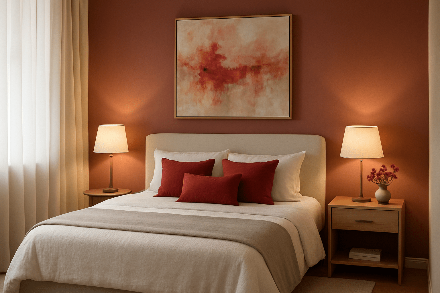
Heidi Caillier Design: Bedroom Retreat - Deep red clay-toned walls paired with green sconces and crisp white linens demonstrate perfect warm-cool balance. Key: Natural balance of warm red with cool green accents.
Explore More Color Inspiration
- How Abstract Art Affects Our Emotions - Discover the psychological impact of color in art and how it transforms your mood and space.
- Redoute Botanical Illustrations - Classic botanical illustrations featuring beautiful red roses and flowers from the master artist.
- Top 10 Interior Design Trends for 2025 - Stay ahead of the curve with the latest interior design trends, including red color schemes.


