

What are popular neutral art styles?
Neutral doesn't mean beige. The styles that work hardest in a quiet palette — tonal abstracts, faded botanicals, black-and-white photography, architectural line drawings — share a logic: low chroma, deliberate negative space, and a single tonal range carried through the image. They settle a room rather than competing with it.
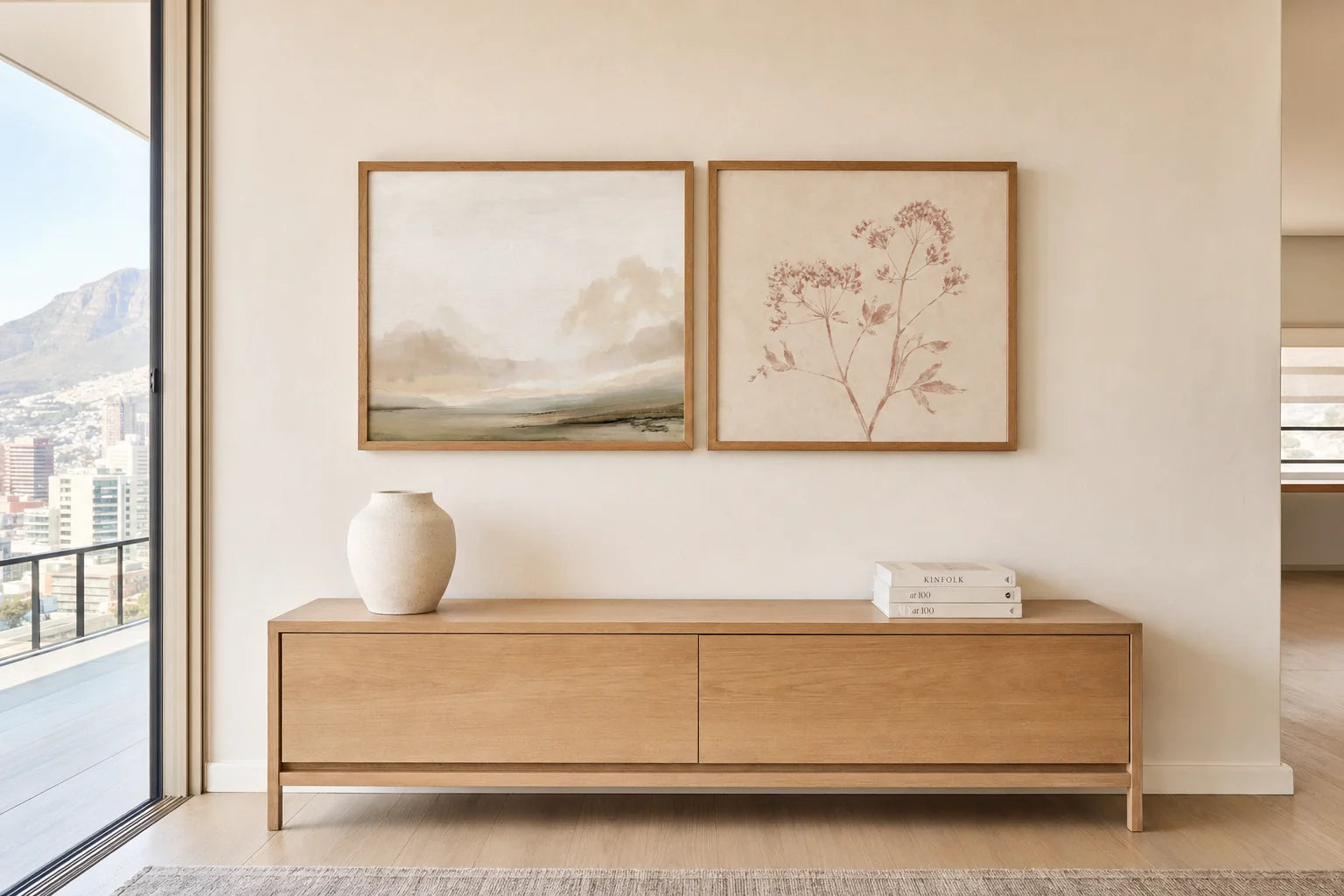
Southern Horizon Calm + Pair of Red Botanicals — A2 Fine Art Paper each, in matching honey-stained Obeche. Two neutral styles, one wall, soft north-facing daylight.
Tonal abstracts — the quiet workhorse
Tonal abstracts — soft greys, warm earth, ochres, taupes — are the most forgiving neutral category we sell. They don't demand a specific room. They don't insist on a story. They give a wall presence without asking the rest of the room to negotiate with them.
The trick is to choose one that matches the temperature of the room's existing palette. Warm ochres beside cool greys can feel dissonant; warm beside warm, cool beside cool, reads as considered. In Highveld light, warm tones soften. On the Atlantic Seaboard, cooler greys hold their dignity.
Black-and-white photography — architecture for the wall
Black-and-white photography is the most architectural of the neutral styles. It introduces structure — a horizon line, a building edge, a figure — without introducing colour. In rooms with a lot of soft furnishing, it provides the geometric counterpoint linen and bouclé can't.
It pairs especially well with tonal abstracts in a gallery wall: the photograph anchors, the abstract softens. Both belong to the same restrained palette without repeating each other.
Neutral doesn't mean absent. The best neutral art has a clear voice — it just chooses to speak quietly.
— A Note from the Studio
Faded botanicals & vintage portraits
Vintage botanical illustrations on tinted paper read as neutral even when there's colour in the image, because the saturation has been pulled back by age — or by deliberate paper choice. They bring narrative to a room without bringing volume. Same logic applies to vintage portraits in muted palettes: the figure is present, but it isn't shouting.
These work best in rooms that need warmth without warmth-of-colour. A Karoo guest bedroom. A study with cane and timber. The kind of room where a saturated print would feel loud.
| Style | Best room | Pair with |
|---|---|---|
| Tonal abstract Warm earth, soft grey | Living room, main bedroom | Linen, bouclé, timber Soft furnishing |
| Black-and-white photograph | Hallway, dining room, study | Tonal abstract In a gallery wall |
| Faded botanical Tinted paper | Guest bedroom, bathroom | Cane, oak, brass Older woods |
| Vintage portrait Muted palette | Study, library, entrance | Leather, walnut Heritage furniture |
The neutral art styles S&G stocks, with the rooms and materials they sit most comfortably alongside.
Architectural lines and texture studies
Architectural and line drawings strip the image to its essentials — a building, a chair, a structural detail — rendered in ink on paper. They're the neutral category that reads most clearly as deliberate. There's no ambiguity about what they're doing on the wall.
Texture studies — linen, sand, marble photographed at close range — sit at the other end of the same spectrum. They're abstract by virtue of scale rather than style. Both work in rooms that already have a strong material story: stone fireplaces, raw timber, plastered walls.
Coastal horizons and vintage maps
Coastal photography in muted tones — fog, overcast light, soft horizons — is one of the few representational styles that genuinely reads as neutral. Bright Camps Bay blues don't qualify. Misty Kommetjie at dawn does.
Vintage maps and charts in neutral inks belong to the same family: representational, but rendered in a palette that doesn't intrude. They suit hallways, libraries, and the kind of room that wants a focal point without wanting drama.

Building a quiet palette? Tell us the room.
Send a photo of the room and a sense of the existing palette — timbers, textiles, the direction of the light — and we'll suggest a few neutral pieces that would settle there. We work with Cape Town homes daily, so the palette guidance is local.
Message Nikki on WhatsApp →


