





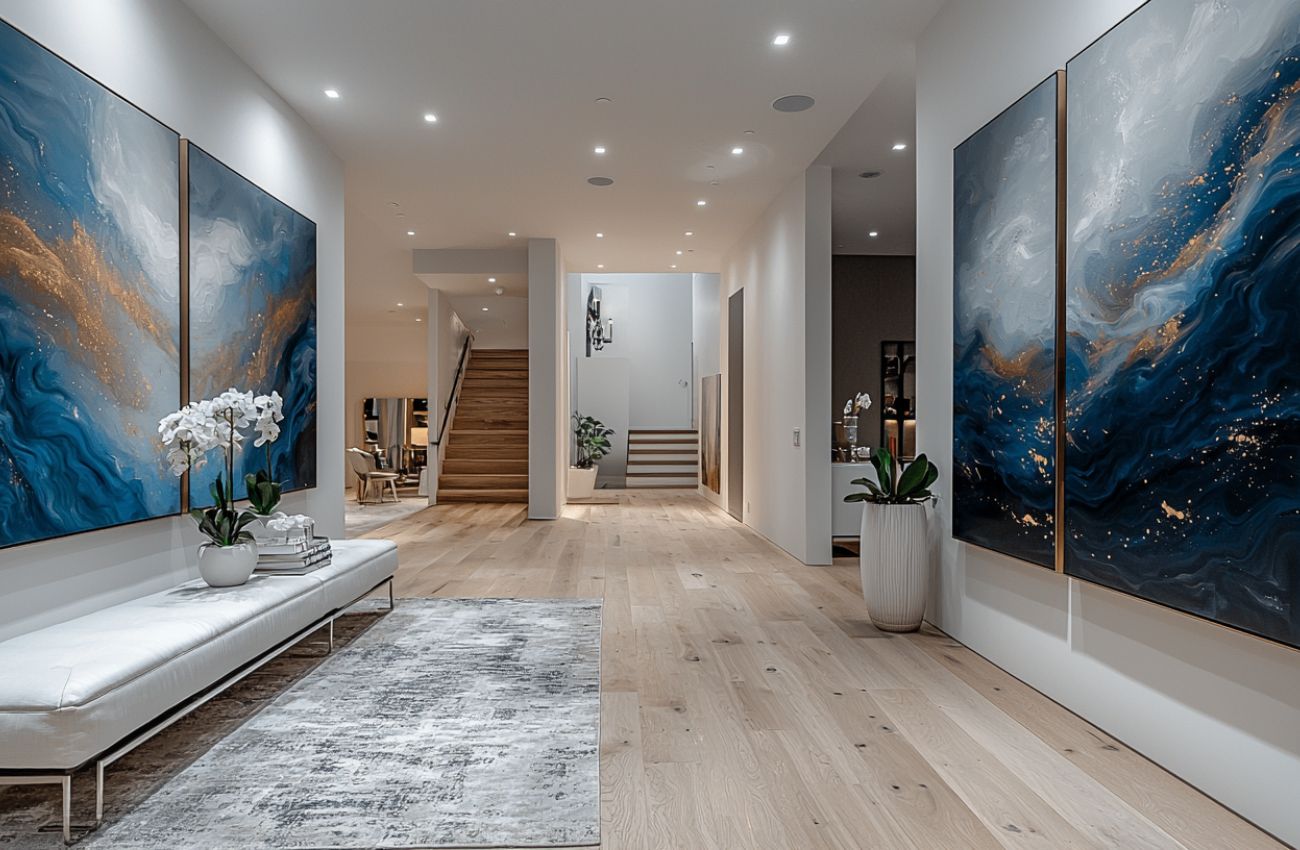
A hallway is not an entrance hall, and art that works by the front door often falls flat halfway down a passage. A corridor is narrow, usually windowless, and — this is the part that changes everything — you almost never stand still in front of it. You read it side-on, at an angle, while walking. That single fact should drive every decision you make about what goes on the wall.
Why a corridor is its own problem
In most rooms you view art head-on from several metres back. In a passage you cannot step back — the opposite wall is often a metre or two away — so a piece sized for a lounge will overwhelm the space and you will never see it properly. You also see it in motion, in sequence, one piece after another. A corridor behaves less like a wall and more like a series of frames in a film.
The practical consequence: favour rhythm over a single statement, keep detail bold enough to register at a glance, and think about the whole run rather than one perfect spot.
A series works better than one large piece
Because the eye travels, a set carries a passage far better than a solitary artwork. A triptych — three related pieces hung in a row — is the most reliable option, giving the corridor direction and drawing you along it rather than stopping you mid-stride.
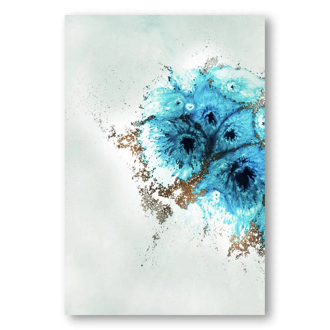
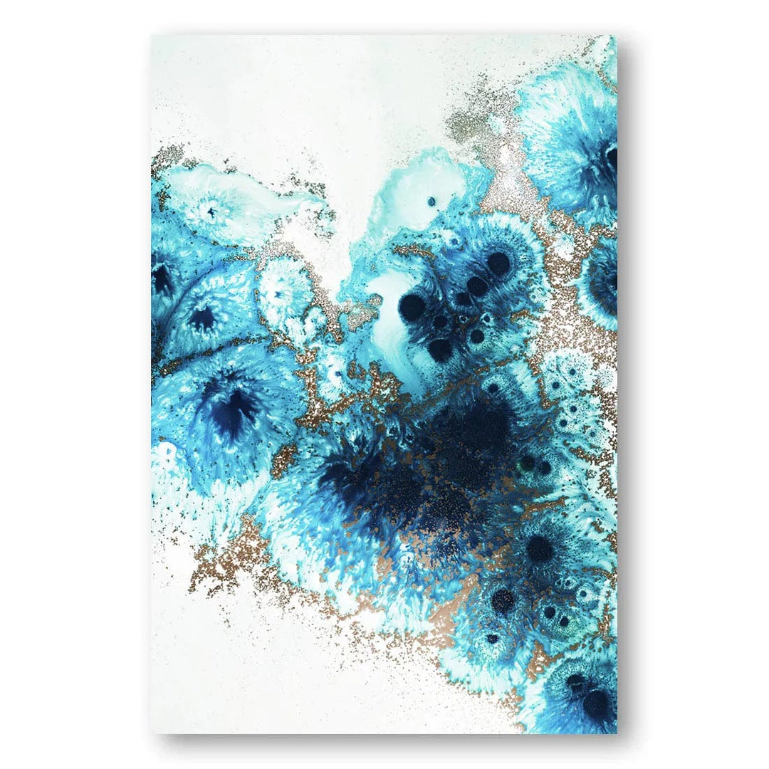
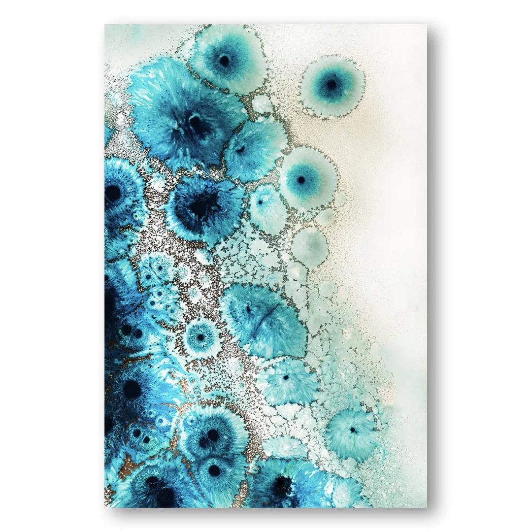
Related works in one palette do the same job without needing to be a formal set. Two, three or five pieces from the same family, hung evenly, read as deliberate. Even numbers work fine along a run — the symmetry argument applies to a wall you face, not one you walk past.
Spacing along the run
Keep the gaps consistent and slightly tighter than you would in a room. 6–8cm between frames holds a sequence together in a narrow space, where wider gaps let the group dissolve into separate pictures. Hang the centre line at 145–152cm as you would anywhere else, and resist stepping it up or down to follow a staircase or a sloping ceiling unless the whole run follows the same angle.
Mark the positions with masking tape before you drill. Corridors expose an uneven line badly, because you see the pieces obliquely and any drift reads as a slope.
Scale in a narrow space
Measure the wall, then be realistic about the viewing distance. In a passage under 1.2m wide, several medium pieces will nearly always beat one large one. Where you do want a single work, a horizontal piece stretches a short corridor and makes it feel longer, while a tall vertical draws the eye up and lifts a low ceiling. Slim frames sit better than deep ones — a chunky moulding catches shoulders and bags in a tight run.
Choosing a mood for a windowless run
Most corridors have no natural light, which pushes the decision one of two ways. You can lean into it with something deeper and moodier, accepting the space as a dim link between rooms, or counter it with lighter work that lifts the gloom.
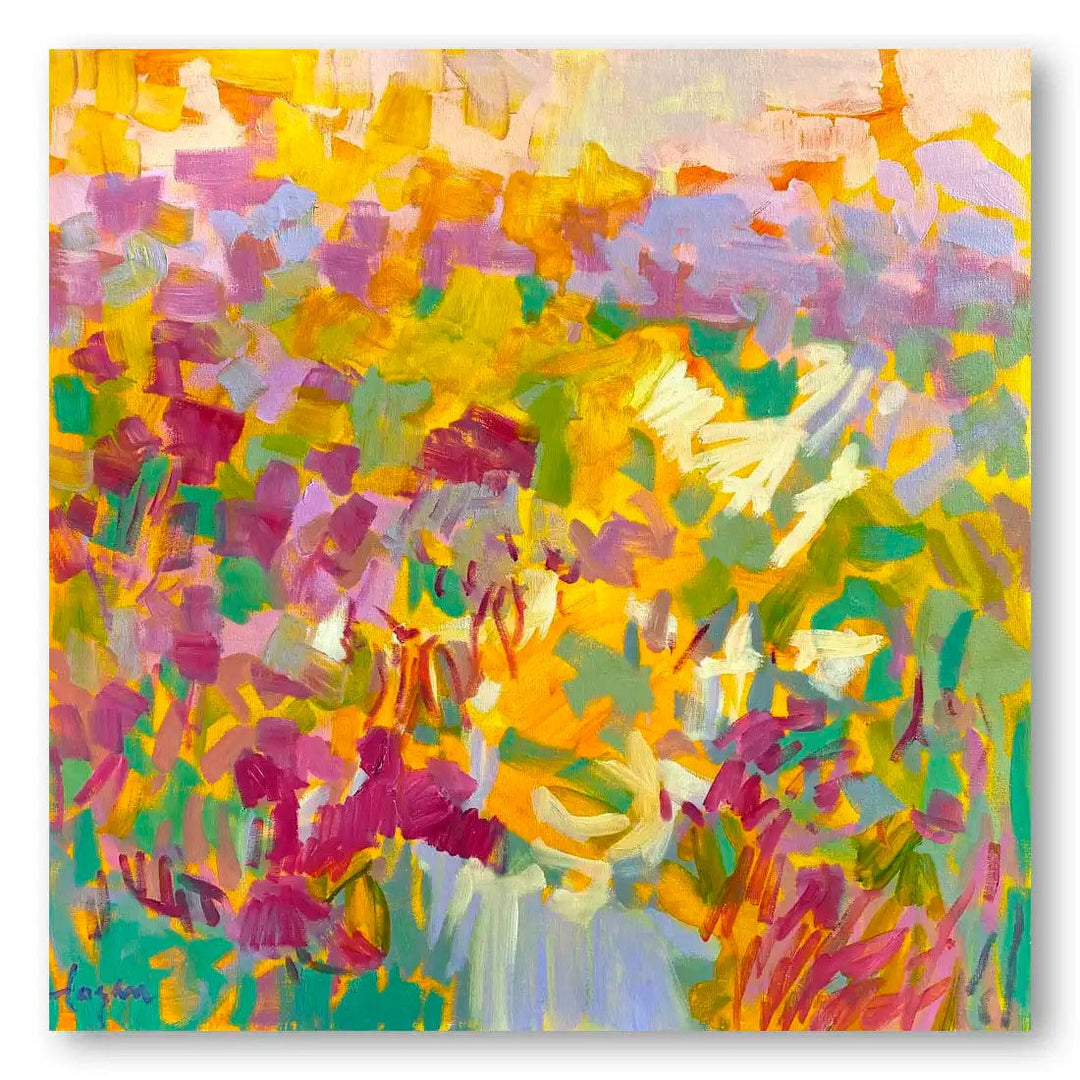
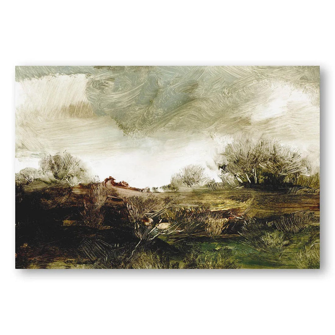
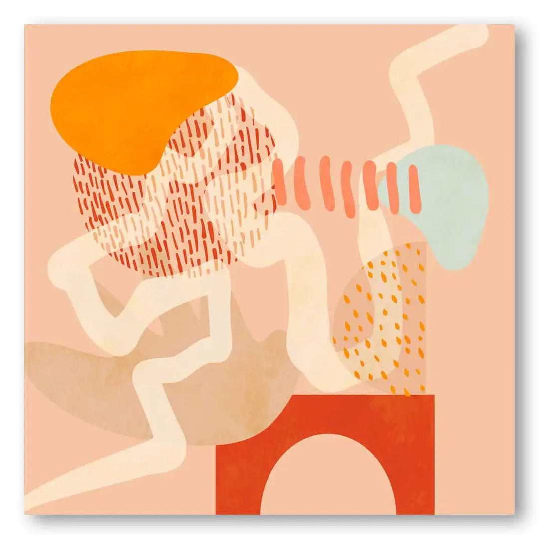
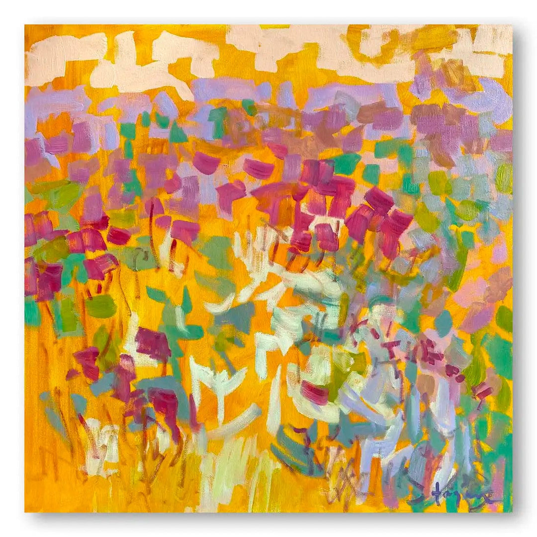
Warmer, brighter abstracts from the bright and bold range give a windowless passage some energy and read well at speed. If the corridor opens onto calmer rooms, the moody neutral range keeps the transition quiet and lets the rooms at either end do the talking.
Soft neutrals to open a tight passage
Pale, low-contrast work is the safest choice in a genuinely cramped corridor. It recedes rather than crowding, and it holds up under artificial light, which flattens strong colour and can turn a vivid piece muddy after dark.
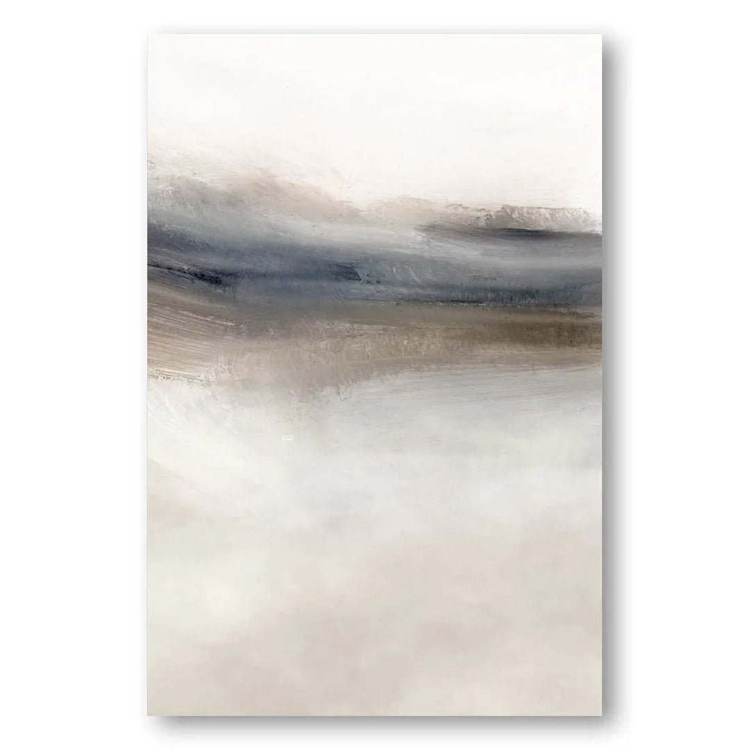
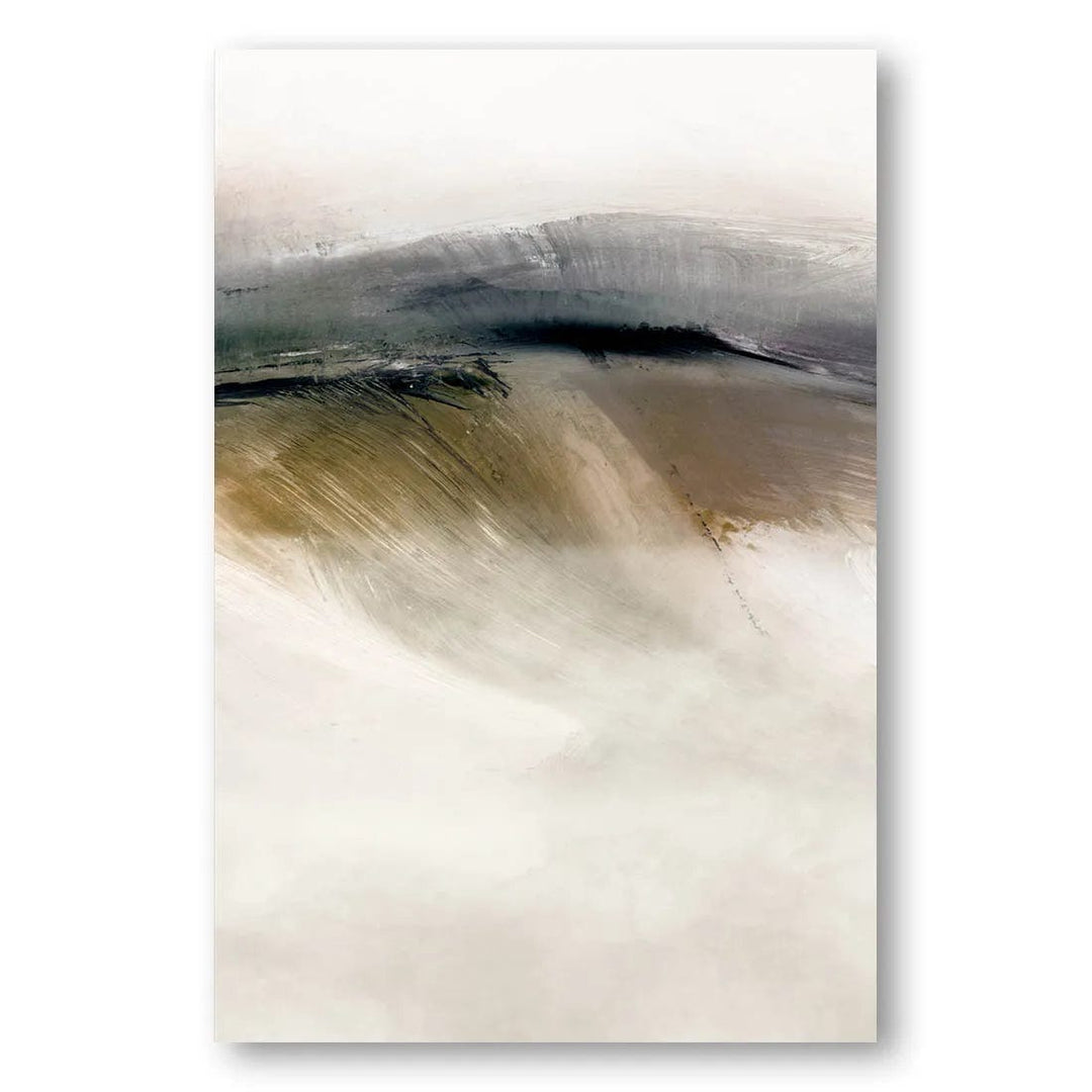
The soft neutral range suits this well, as does anything monochrome. Black and white work is largely immune to bad corridor lighting because it never relied on colour temperature in the first place.
Lighting the wall properly
A corridor is usually the worst-lit part of a house, and a single ceiling fitting overhead will throw the frame’s own shadow down the artwork. Picture lights or small directional spots angled at roughly 30 degrees solve it. If rewiring is not on the cards, choose work with strong tonal contrast, which survives poor light far better than subtle colour shifts do.
Working around doors and traffic
Few passages give you an uninterrupted wall. Treat each stretch between doorways as its own unit rather than running one sequence across a door, and keep the arrangement clear of light switches and handles. Hang above shoulder height where you can — a hallway takes knocks from bags, prams and vacuum cleaners in a way a lounge never does — and stay off the wall you brush past on the turn.
Building it up over time
A passage gallery wall does not have to arrive complete. Start with three or four pieces at one end, hang them off-centre so the group has somewhere to grow, and add as you find things. Holding the colours to one family is what keeps it looking collected rather than accumulated.

Browse the full abstract collection if you are starting from scratch, or the abstract realism range for work with a little more form to it.
Carrying the style through the house
A corridor connects rooms, so it is the one wall that should not be styled in isolation. Pick up a colour from a room at either end and the passage will read as part of the house rather than a leftover strip between the parts that were decorated.
Frequently Asked Questions
What size art suits a narrow hallway?
In a passage under about 1.2m wide, several medium pieces work better than one large one, because you cannot step far enough back to take in a big work. A horizontal piece makes a short corridor feel longer; a vertical one lifts a low ceiling.
How far apart should hallway prints be hung?
6–8cm between frames, kept consistent along the whole run. Tighter than a living-room arrangement, because a corridor is seen at an angle and wider gaps break the group apart.
What if my hallway has no natural light?
Choose work with strong tonal contrast, or monochrome pieces, which hold up under artificial light. Subtle colour relationships tend to go flat. Picture lights or angled spots make a substantial difference if you can fit them.
Should hallway art match the rooms it connects?
It should share a palette with them rather than match exactly. Picking up one colour from a room at either end ties the corridor into the house without making it feel like an extension of either room.


